Setayesh Ahmadi — portfolio deck 23 slides · 16:9 Print → “Save as PDF”, landscape, margins none, background graphics on
PortfolioGraphic designer2026

setayesh
ahmadi

graphic designer

Exhibition identity · photobooks · Persian editorial typesetting · product catalogs · landing pages and social content.

mynameissetayesh@gmail.com+98 921 893 400901 / 23
About00
Portrait of Setayesh AhmadiSetayesh Ahmadi

about

Trained in the graphics program at Sooreh University, and two years into practice — moving between printed matter and the screen: exhibition posters and postcards, a black-and-white photobook, Persian literary spreads set right-to-left, product catalogs, and the pages and posts that surround a launch.

Most of the work starts in a text block. Long Persian columns that hold their rhythm at body size, a photograph allowed to be quiet, and a grid strict enough that one deliberate break reads as a decision.

Age
25
Education
Sooreh University — BA, Graphics
In practice
2 years, since graduating in 2024
Languages
فارسی / English
Setayesh Ahmadi02 / 23
Capabilities00

what
i do

Print-first, but the same identity has to survive a phone screen — so the catalog, the poster and the landing page get built from one set of decisions.

  • 01Exhibition & brand identity
  • 02Book and editorial design — LTR + RTL
  • 03Print production — catalog, brochure, résumé
  • 04Social content & campaign assets
  • 05Landing pages & site content
Setayesh Ahmadi03 / 23
ContentsSelected work

selected work

01ali gholi ziaeeExhibition identity
02kumuLogotype & brand system
03philips home accessExhibition stand
04the photobookMonograph, landscape
05persian editorialRTL typesetting
06arya yaragh sanatCompany profile
07htn prime — digitalLanding, site, social
08the product catalogSquare, chaptered
Setayesh Ahmadi04 / 23
01 — Ali Gholi ZiaeeExhibition identity

ali gholi
ziaee

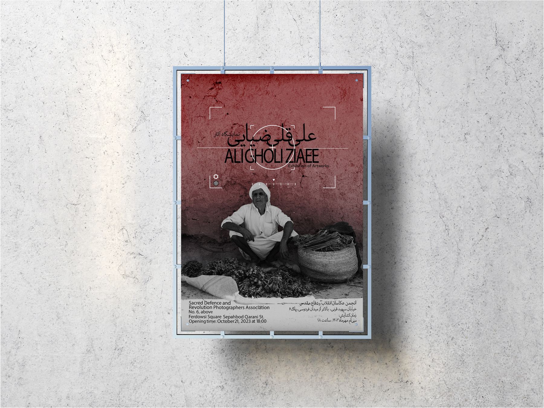
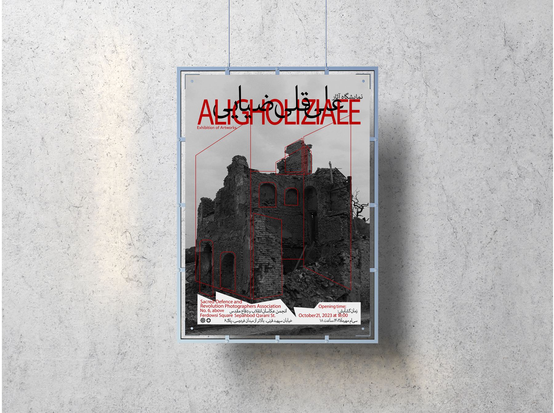
Identity for a photography exhibition, built from the photographer's own frames. Route A lays a thin red rule over a ruined façade and locks the bilingual title into the rubble line.
ClientIranian Photographers' Association
ScopePoster, postcard, envelope
Settingفارسی / English
A2 posterTwo routes Bilingual lockupRegistration marks
Exhibition poster on a concrete wall: a ruined stone façade with thin red rules and a bilingual titleRoute A — title set against the rubble line
Setayesh Ahmadi05 / 23
01 — Ali Gholi ZiaeeRoute B & postcards
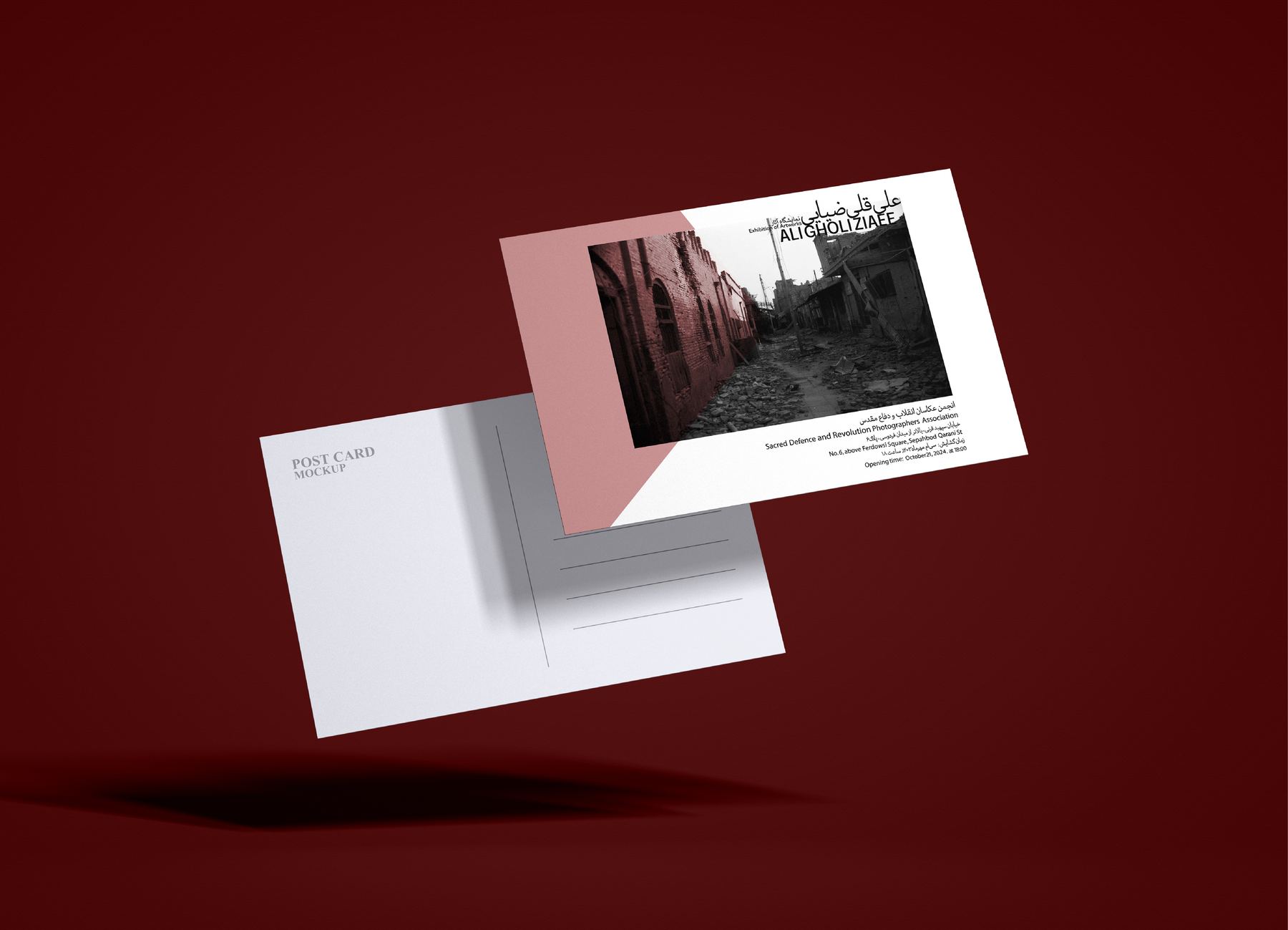
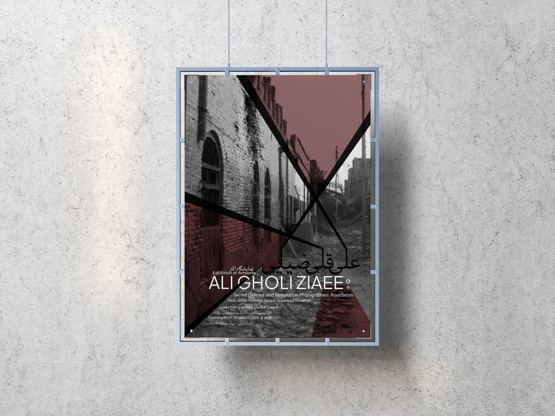
Poster route B: a muted rose field with a street photograph and the title set lowRoute B
Poster route B with a seated portrait and a Persian title above the Latin lockupPortrait variant
Invitation card and envelope against a deep red backdrop
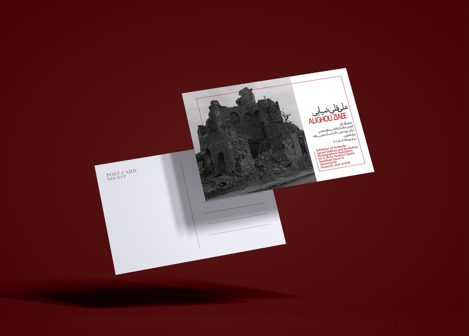
Postcard front and back with a narrow street photograph

The postcard set carries the same lockup onto oxblood stock — one colour, printed flat, so the photograph on the reverse is the only image in the piece.
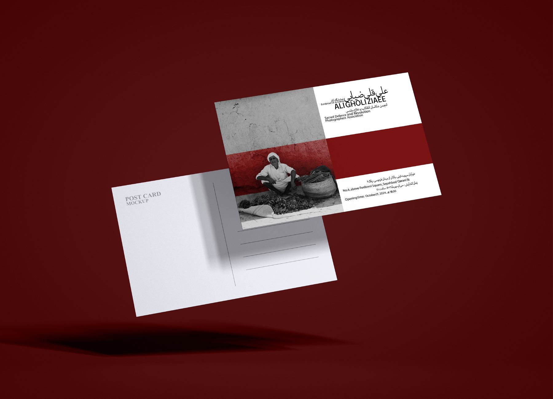
Postcard set with a red band, portrait photograph and bilingual typography
Setayesh Ahmadi06 / 23
02 — KumuLogotype

kumu

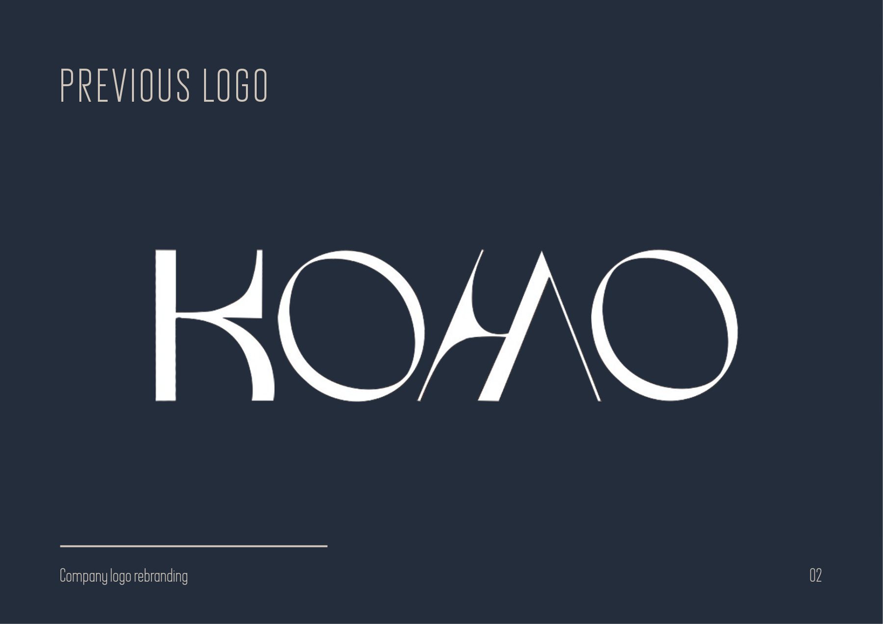
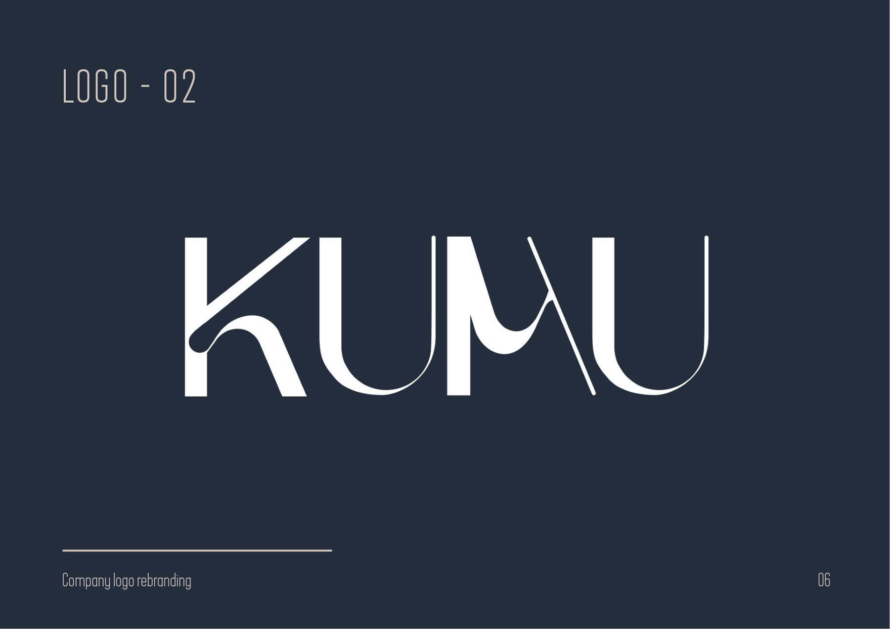
A furniture maker changing its name, and a logotype that had to change with it. The old KOMO mark already had the right instinct — wide, open, a little architectural — so the rebrand kept the instinct and rebuilt the drawing.

ClientKumu Modern Furniture
ScopeLogotype, brand system, guidelines
FromKOMO → KUMU
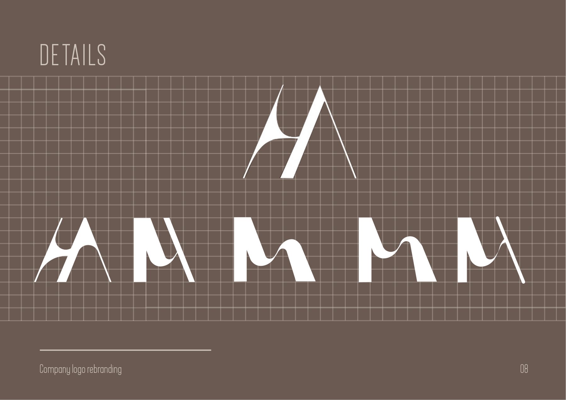
LogotypeLetterform construction Guidelines
The KUMU logotype over a photograph of a wooden armchairFinal mark
The previous KOMO logotype on dark navyBefore
The new KUMU wordmarkAfter
Setayesh Ahmadi07 / 23
02 — KumuBrand system
Construction page showing the shared angled stroke behind each letterOne stroke, four letters
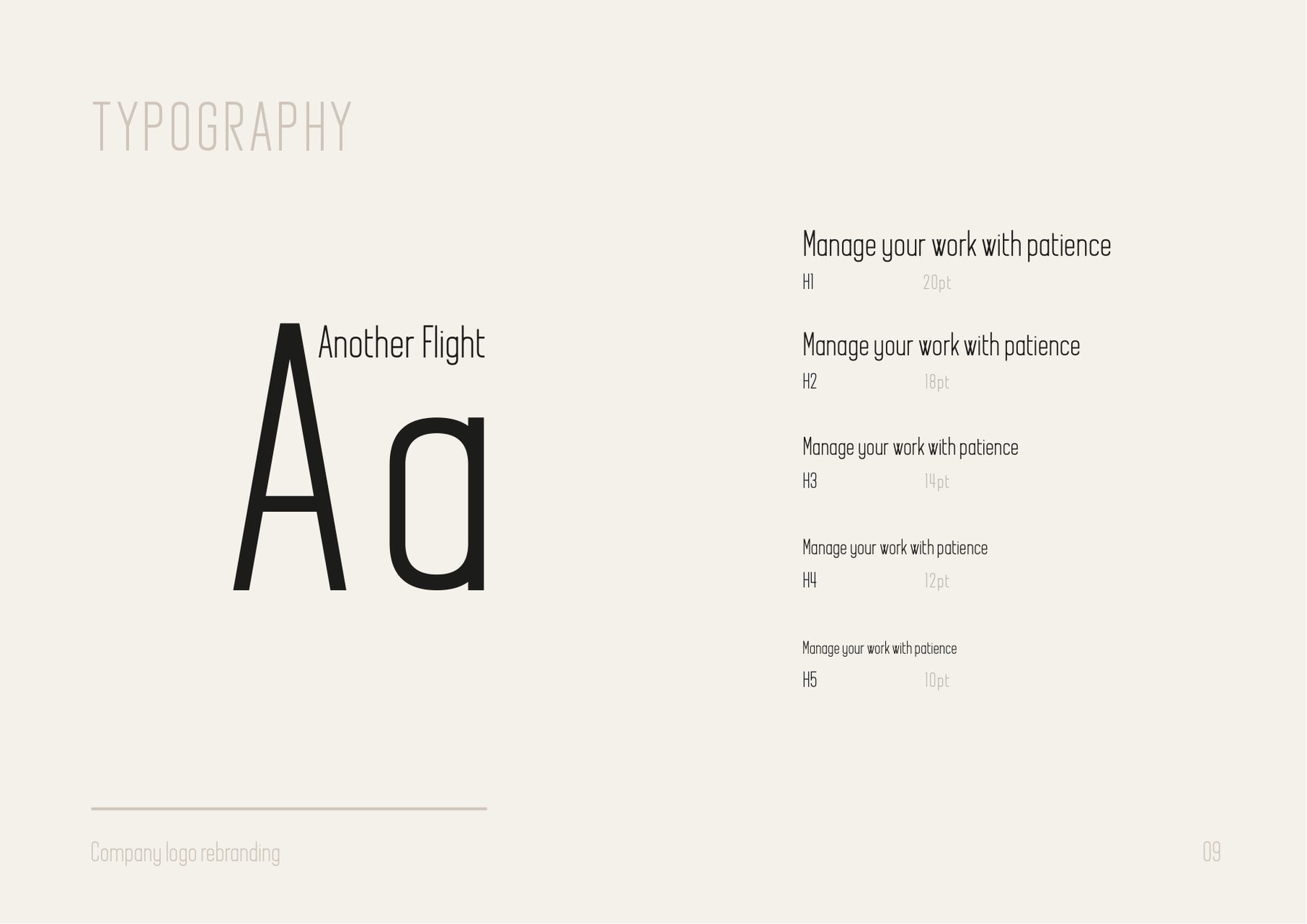
Typography page with the display face and a five-step scaleType scale
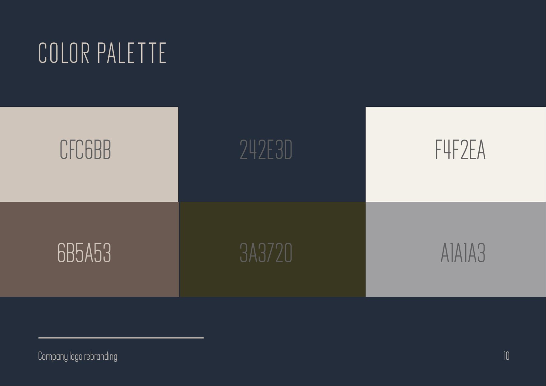
Colour palette page with six swatches and hex valuesPalette
CFC6BB
242E3D
F4F2EA
6B5A53
3A3720
A1A1A3
Every letter comes off one construction — which is why the word holds together over a photograph.08 / 23
03 — Philips Home AccessExhibition stand

philips
home access

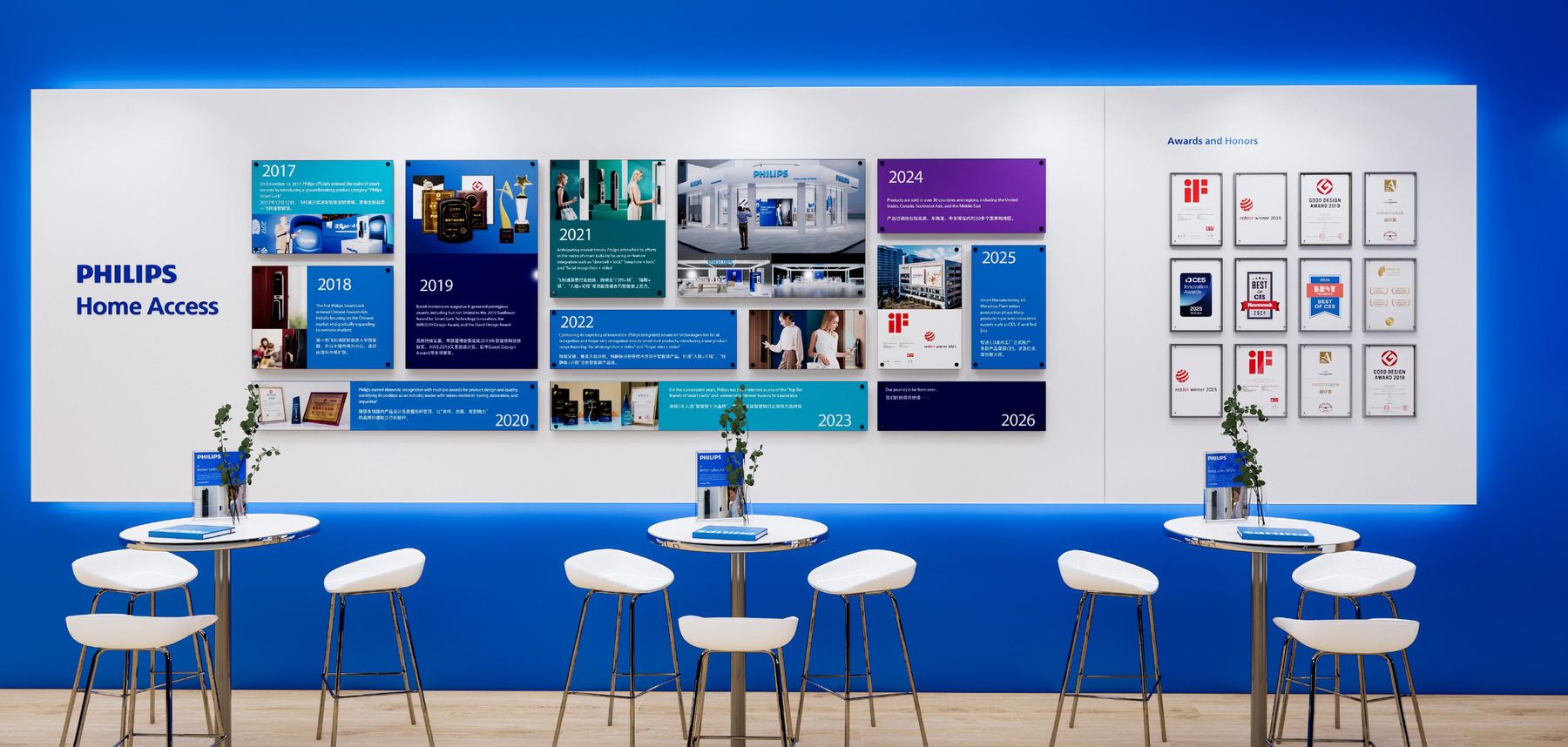
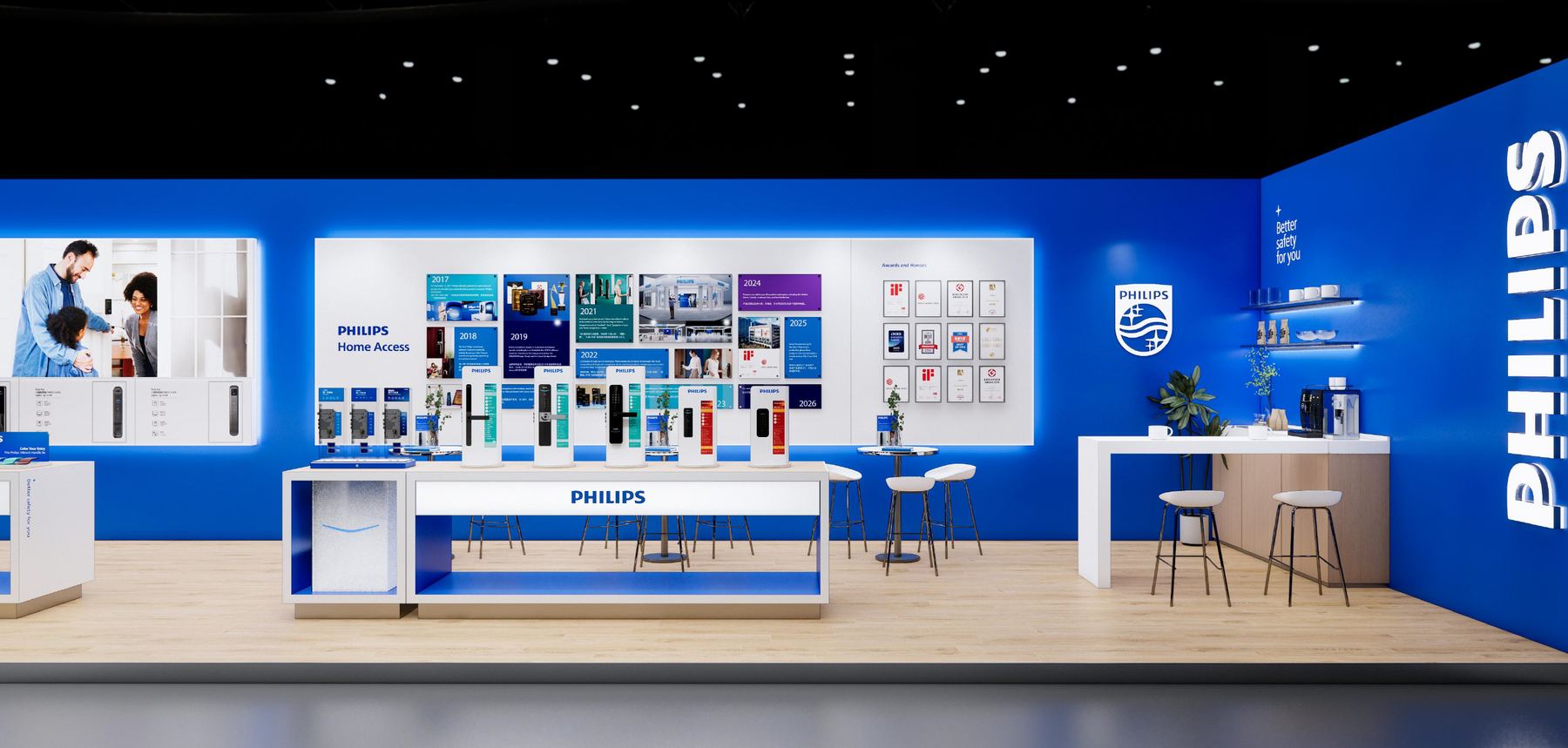
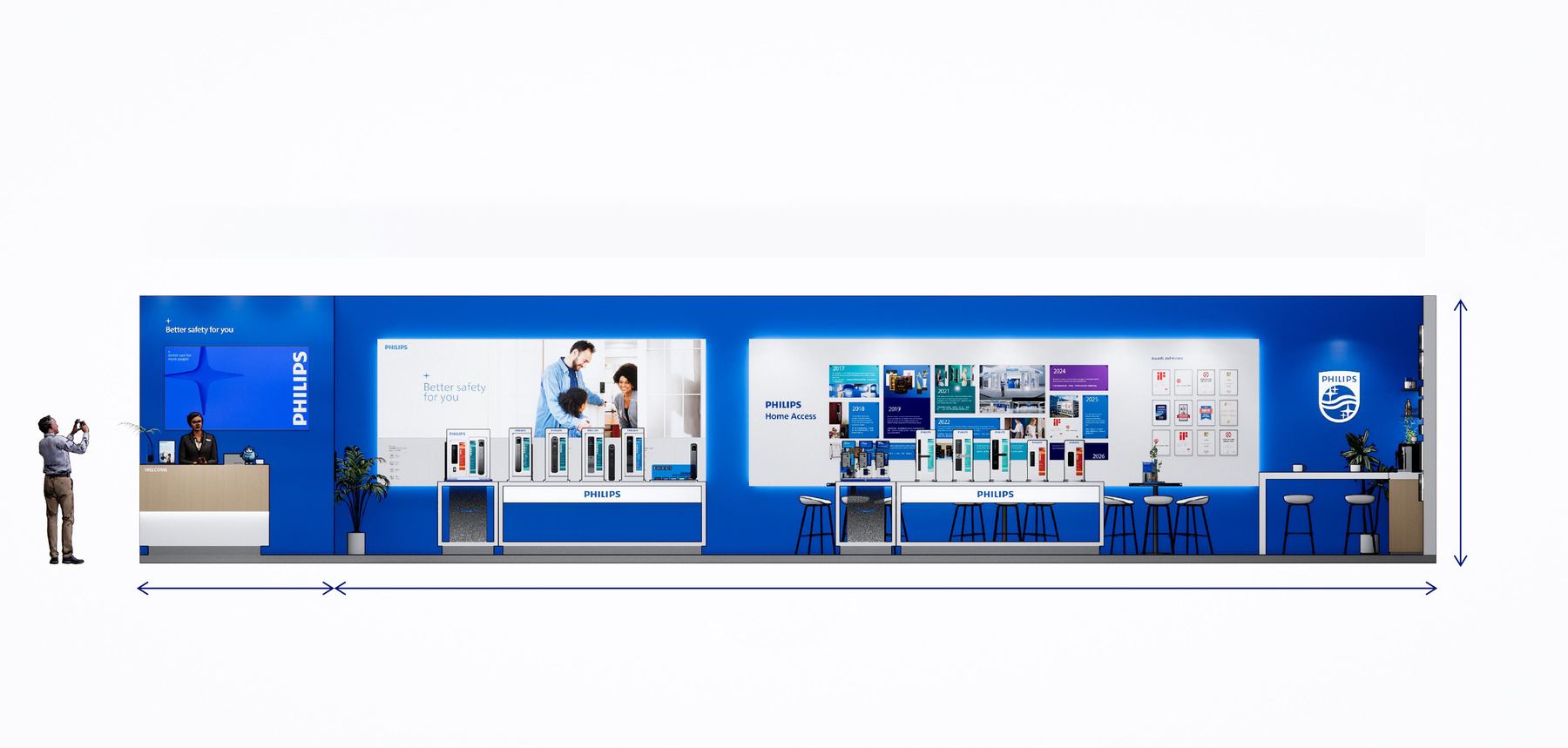
A trade stand is a brand you can walk into, and the rules change: type has to survive being read across a hall, and graphics have to work as architecture. The long wall runs as one unbroken Philips blue, carrying an award timeline from 2018 to 2024.
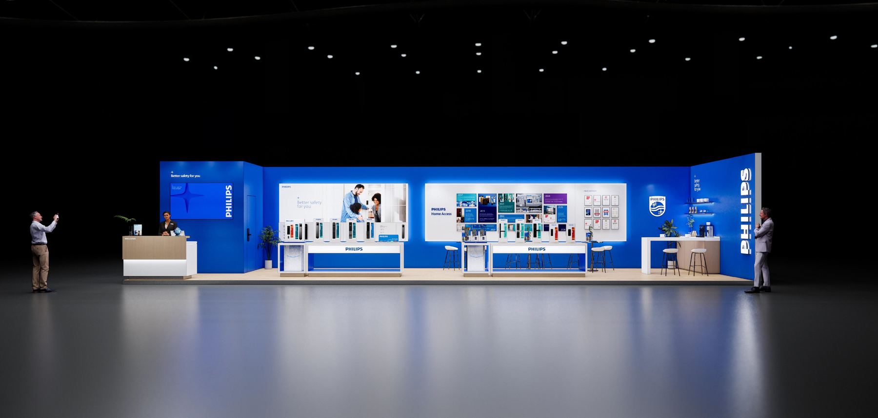
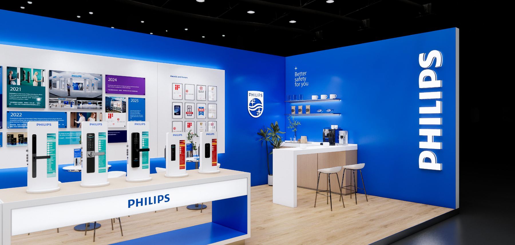
ForHTN Prime · Philips Home Access
ScopeStand, wall graphics, invitation
Show8th Tehran Architecture Exhibition
Exhibition designEnvironmental graphics Elevation drawing
The Philips stand head-on in a darkened hall, a long blue wall lit from within
Stand interior with product wall and counterInterior
The long wall carrying a timeline of design awards2018 → 2024
Setayesh Ahmadi09 / 23
03 — Philips Home AccessWalls & elevation
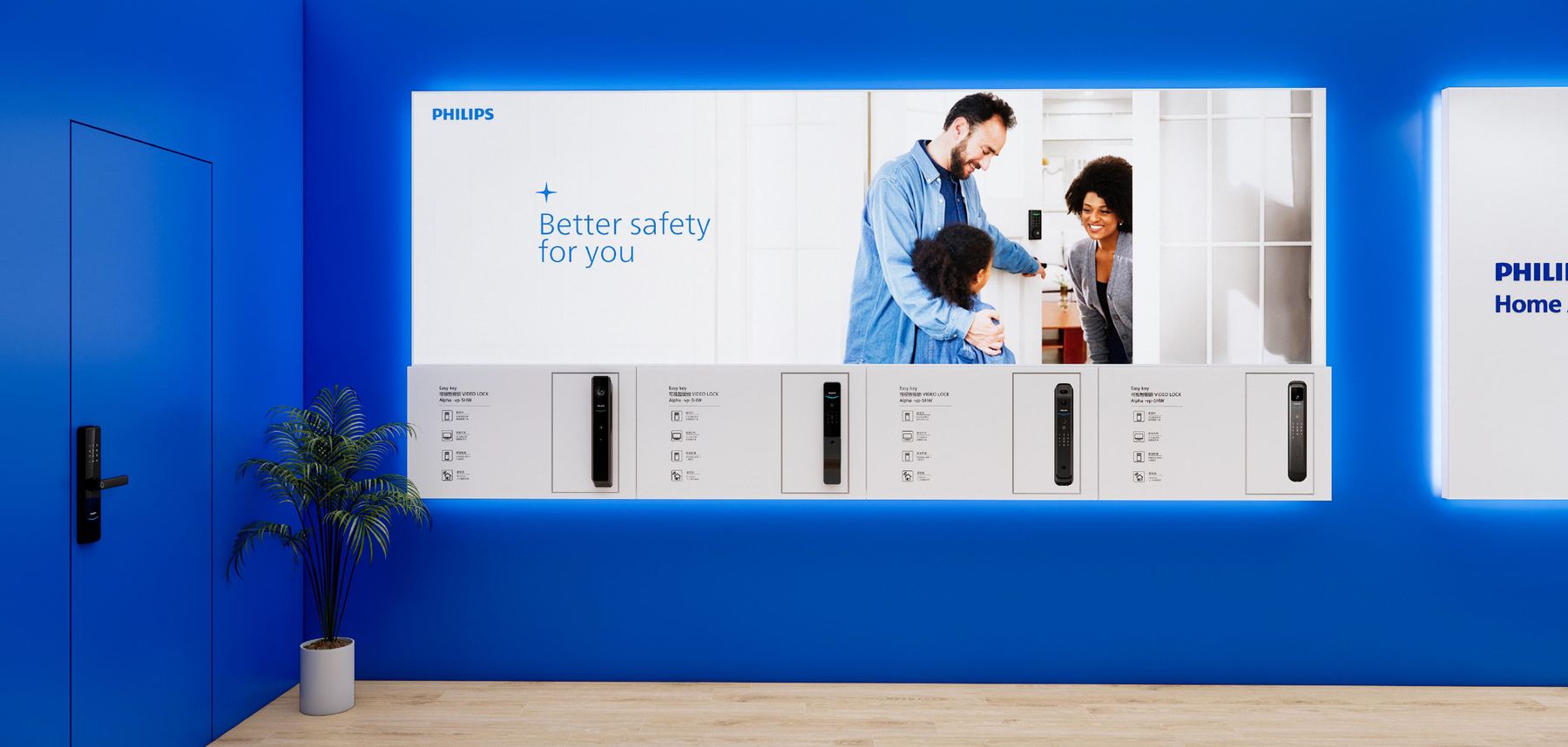
Better safety for you campaign wall with a screen and a row of smart locksCampaign wall
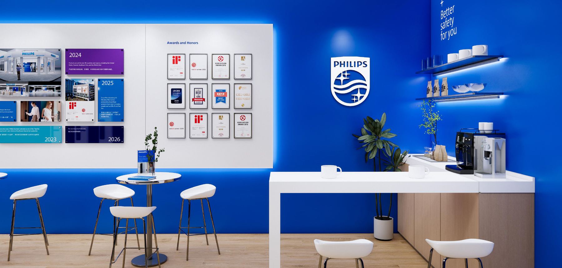
Seating area with the Philips shield and framed award certificatesSeating & awards
Side view with the PHILIPS wordmark running down the return wallReturn wall
Measured elevation drawing of the stand with overall dimensions and a figure for scaleElevation — drawn to build
Product bays step forward out of the wall so the locks sit at hand height.10 / 23
03 — Philips Home AccessInvitation

the invitation

An invitation has one job a poster doesn’t: it has to get someone across a city and into a specific booth.

So the bottom third isn’t decoration — it’s a rendered floor plan with the two stands pinned on it and a QR code beside them. Above that the type stays out of the way: black ground, one weight of white Persian text, the HTN Prime and Philips lockups given room to be recognised at a glance in a message thread.
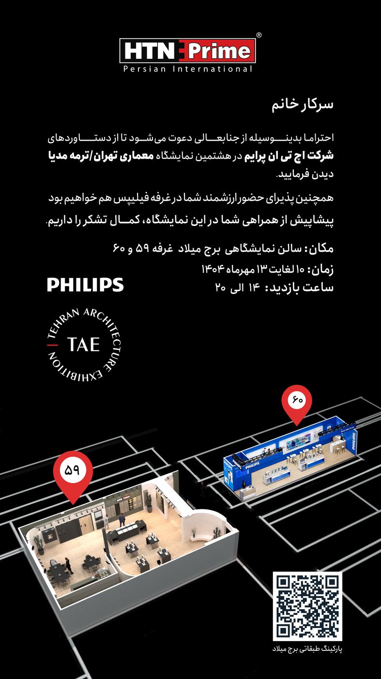
VenueMilad Tower — booths 59 & 60
Format9:16, for messaging and stories
Vertical invitation on black with HTN Prime and Philips lockups, Persian text, a 3D floor plan and a QR code
Setayesh Ahmadi11 / 23
04 — The photobookMonograph

the
photobook

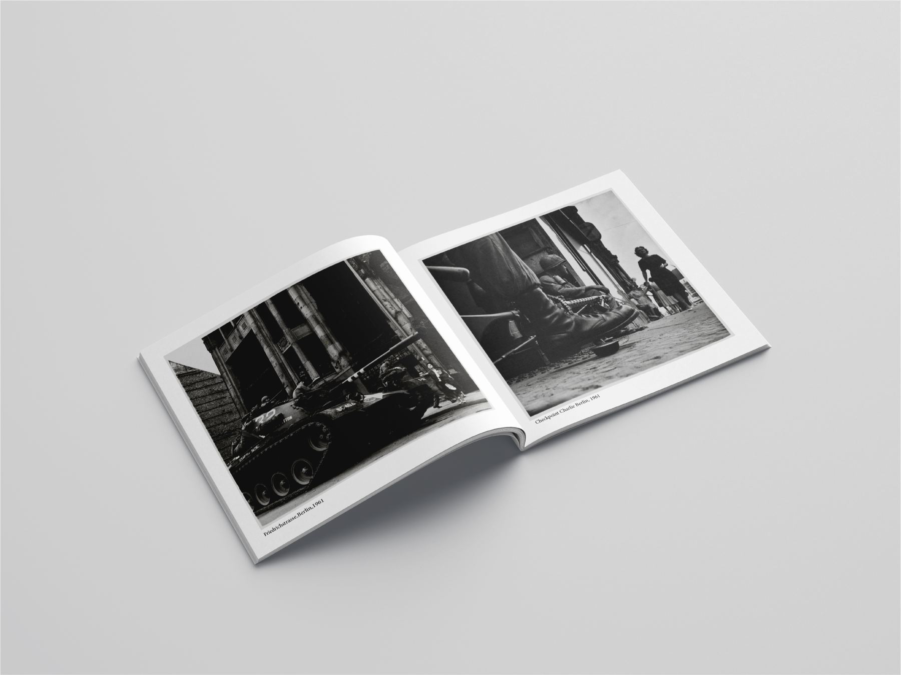
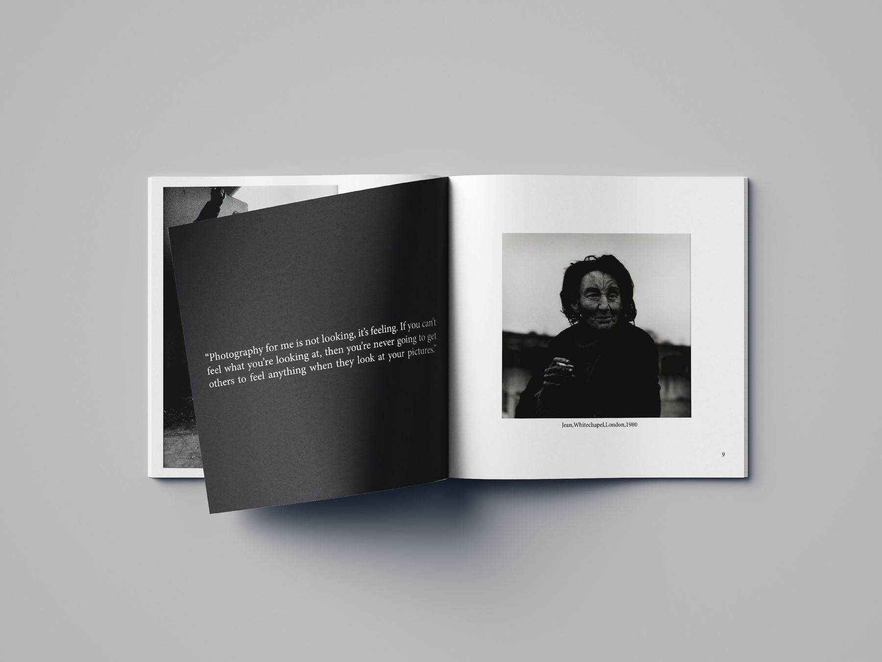
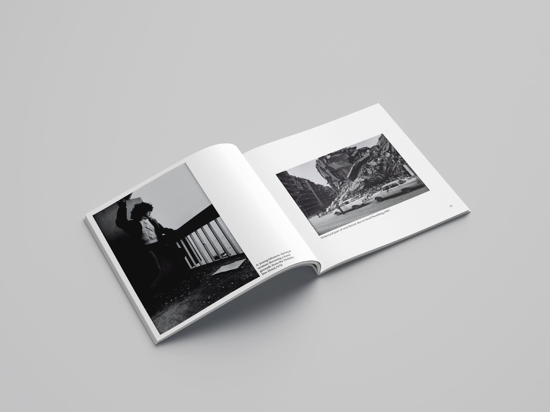
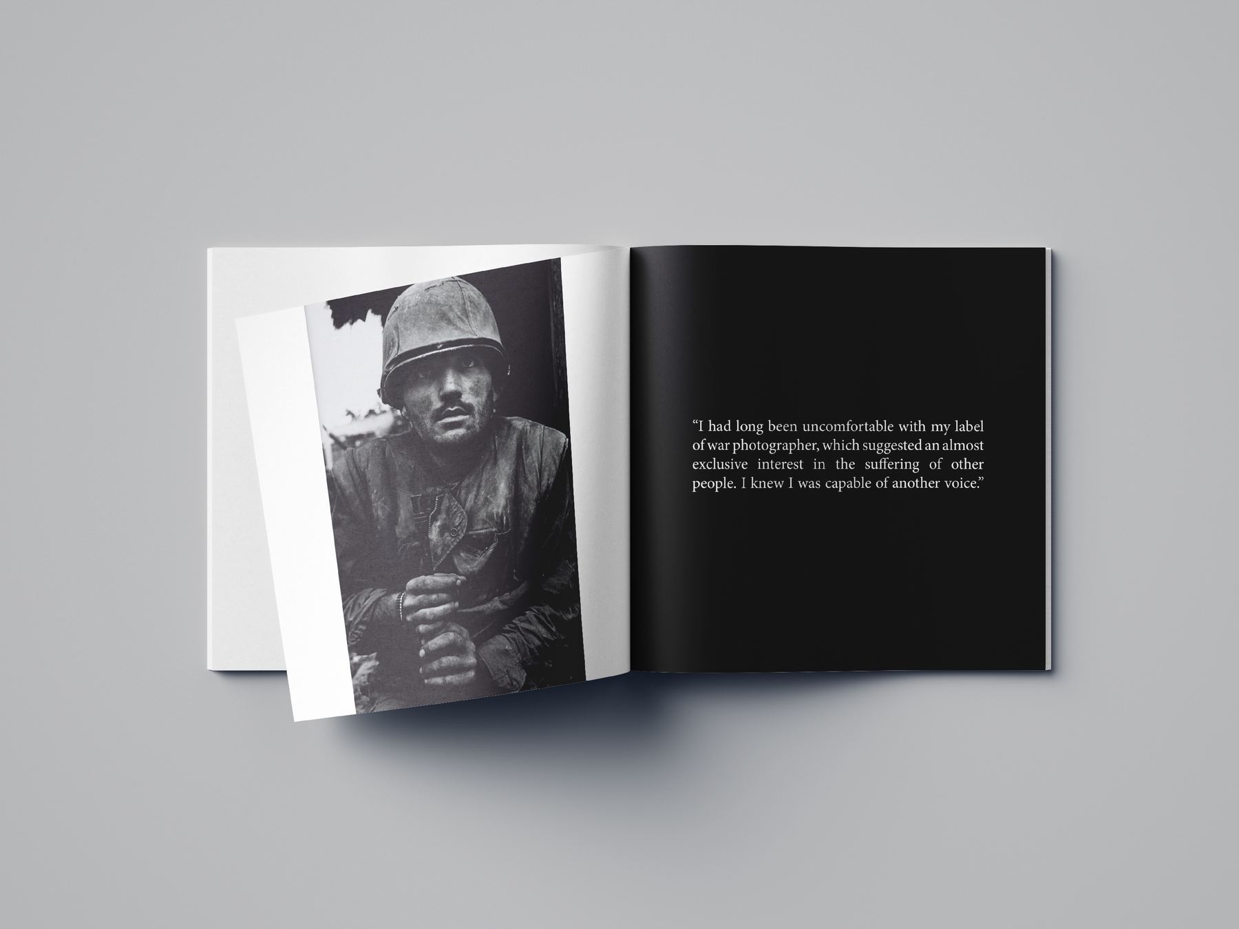
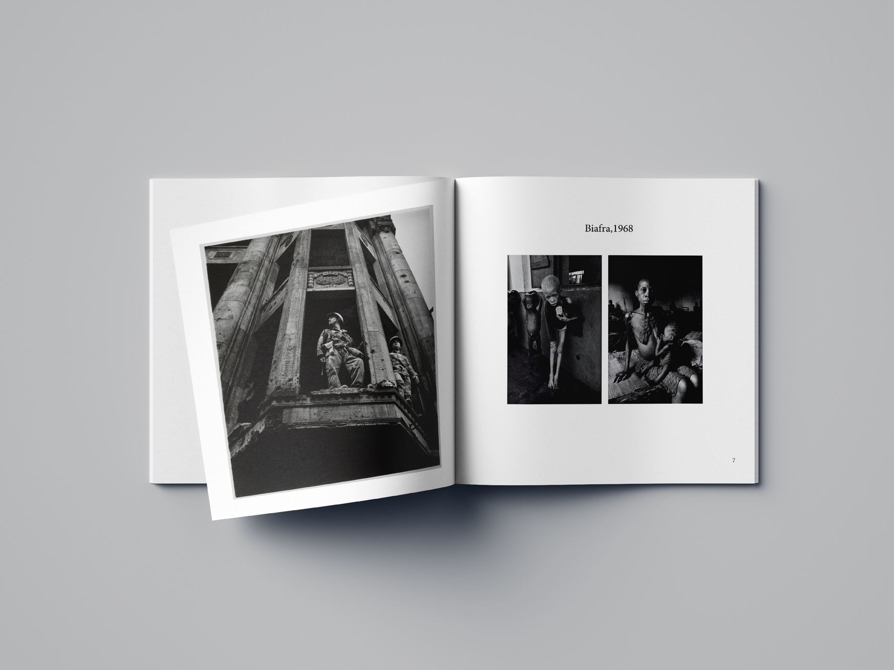
A landscape monograph of black-and-white documentary photographs. One grid runs the whole book: plates sit full-bleed, half-bleed or small on white, and the page turn decides which.
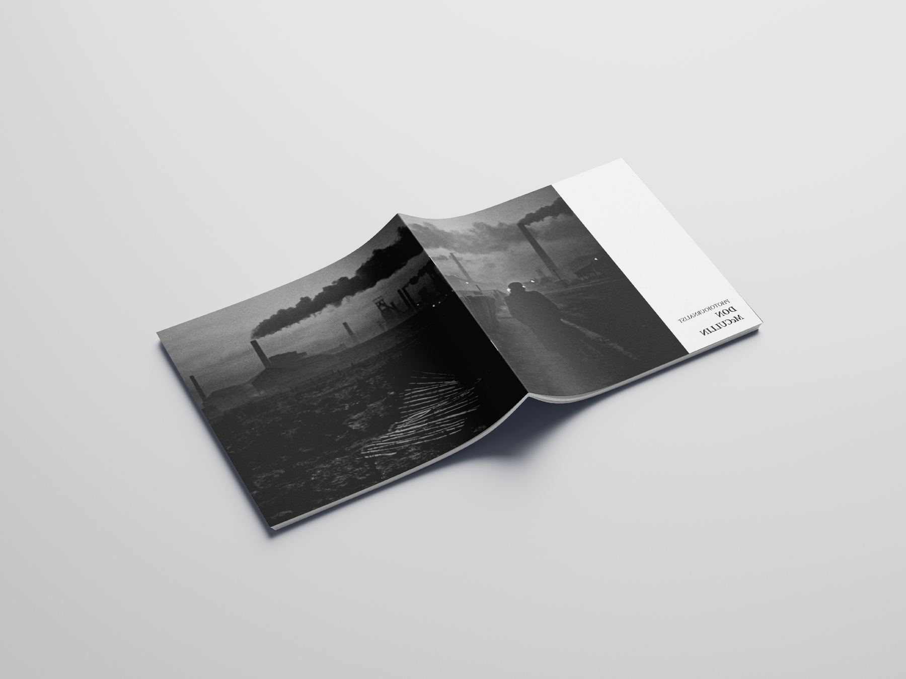
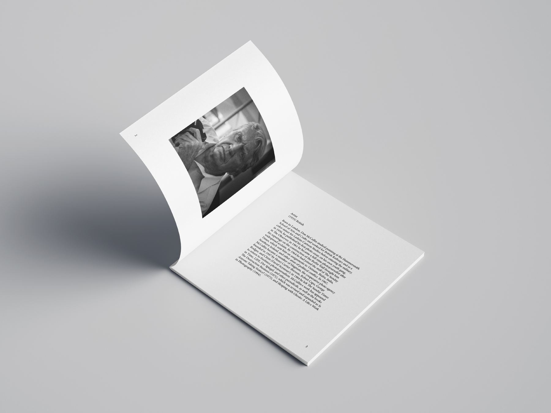
FormatLandscape, perfect bound
ScopeGrid, sequencing, typesetting, repro
SequencingOne grid Caption systemBlack chapter spreads
Photobook open to a full-bleed landscape photograph across the gutter
Spread with a small plate on the left and a text column on the right
Two documentary photographs facing each other
Setayesh Ahmadi12 / 23
04 — The photobookSpreads
Black chapter spread with a portrait plate and a short text blockChapter opener
Spread pairing a portrait with a landscape plate
Black spread with a photograph of a worker facing a block of set text
The book seen from above, open to two plates with captions beneathPlates & captions

Chapter openers invert to black so a single frame can carry a spread on its own. Captions stay in one narrow measure at the foot — the same measure, every page, so the reader stops noticing it.

Setayesh Ahmadi13 / 23
05 — Persian editorialRight-to-left

persian
editorial

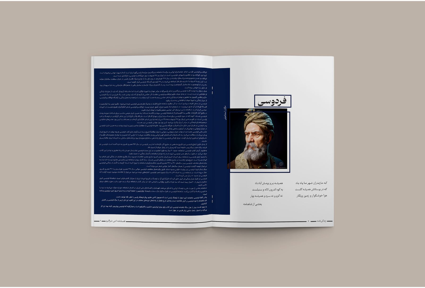
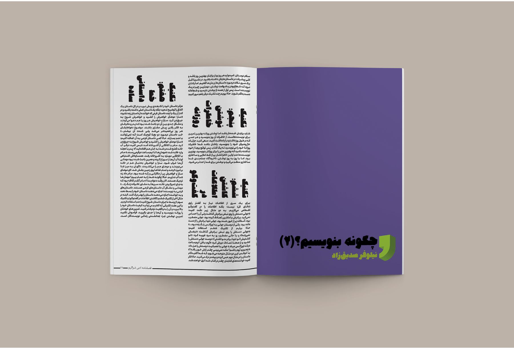
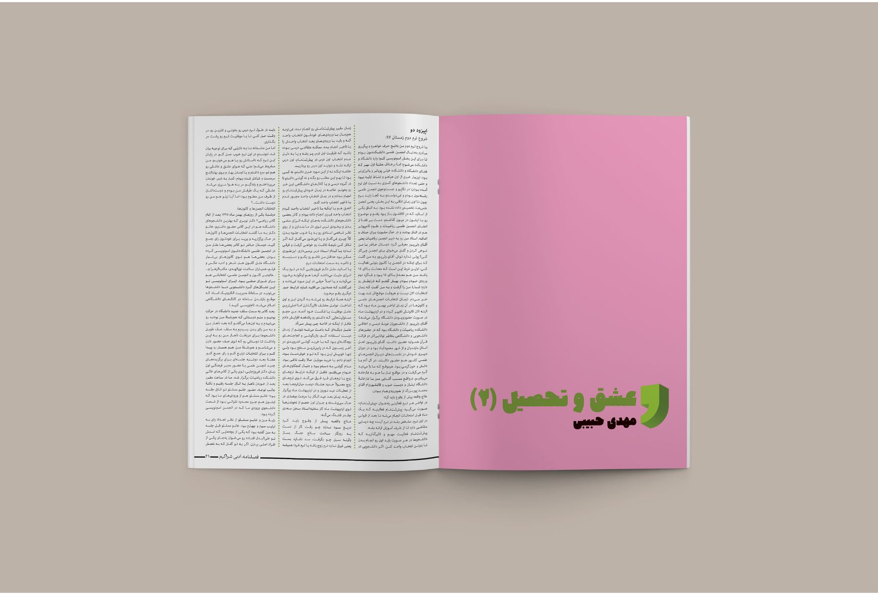
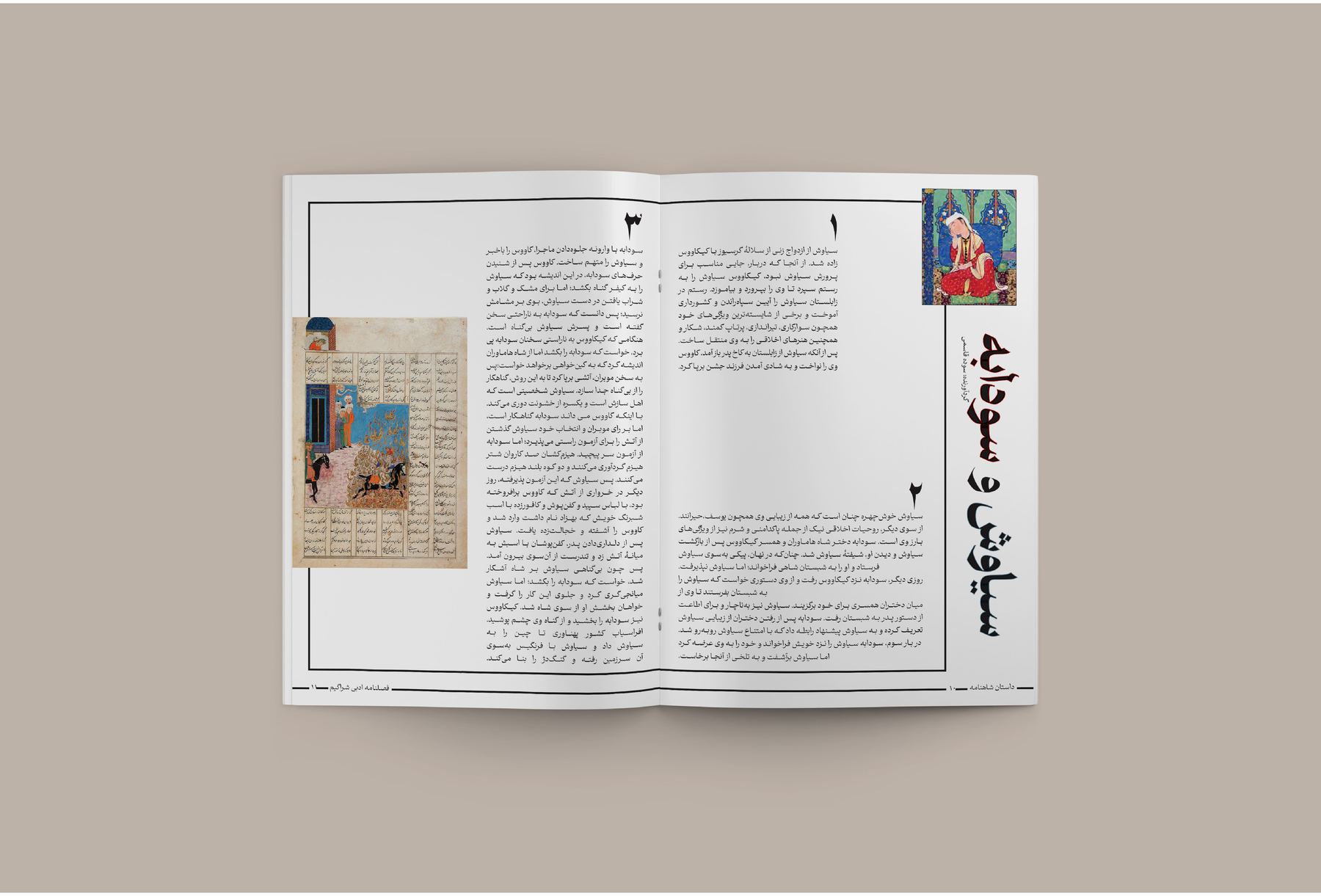
Long-form Persian, set to be read rather than looked at. Justified right-to-left columns hold an even colour down the page; a feature on Ferdowsi builds its opening out of the mausoleum's own stone.
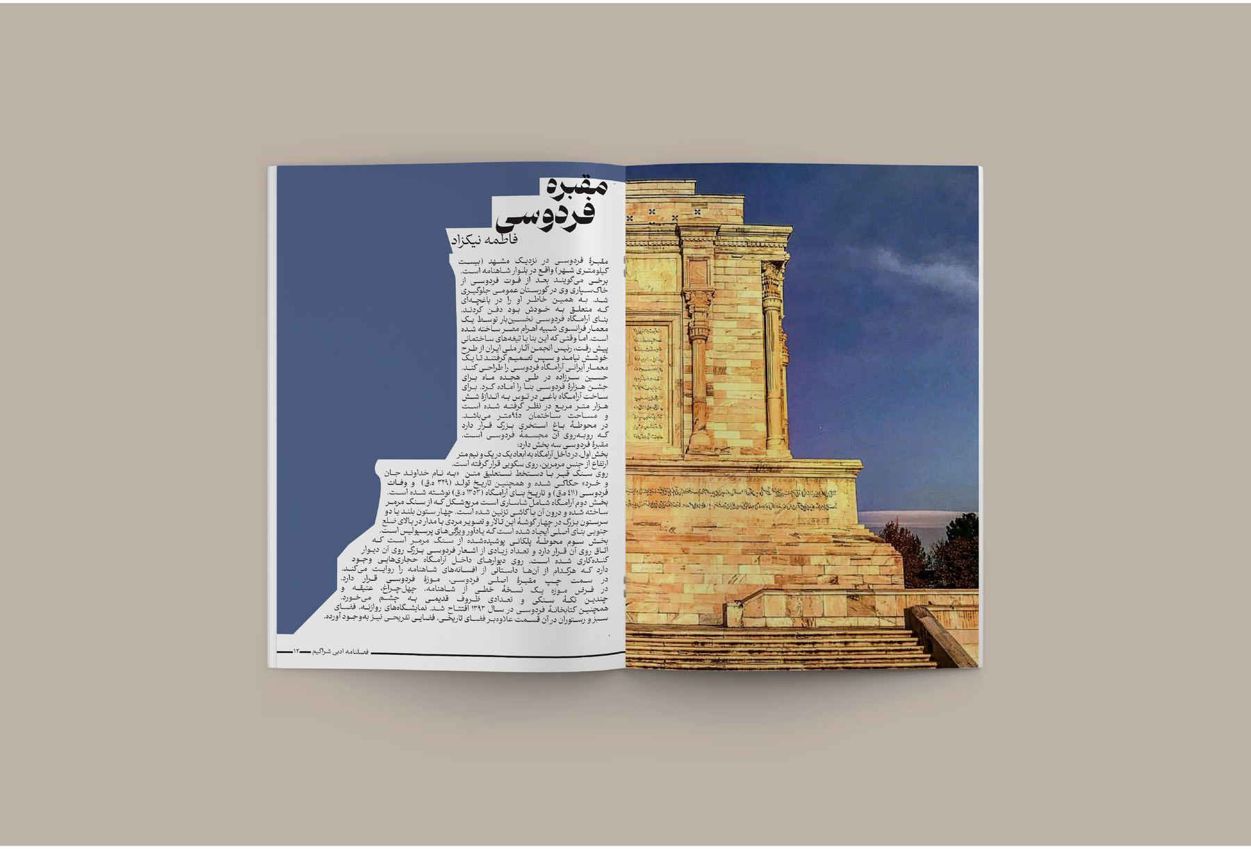
DirectionRTL
ScopeCovers, features, long-form typesetting
SubjectsFerdowsi · chess · classical literature
Justified columnsCover system Manuscript reproMarginalia
Open spread: a photograph of the Ferdowsi mausoleum runs across both pages with Persian text set into the stoneFerdowsi — opening spread
A deep blue text page facing a framed portrait of FerdowsiPortrait page, set on blue
Setayesh Ahmadi14 / 23
05 — Persian editorialCovers & interiors
Purple cover facing a text page illustrated with a row of chess piecesChess essay
Pink cover with a green leaf mark beside a justified Persian text pageCover system
Spread with Persian manuscript miniatures placed in the outer marginManuscript repro
Covers land in flat institutional colour — the title is the only event on the page.15 / 23
06 — Arya Yaragh SanatCompany profile

arya yaragh
sanat

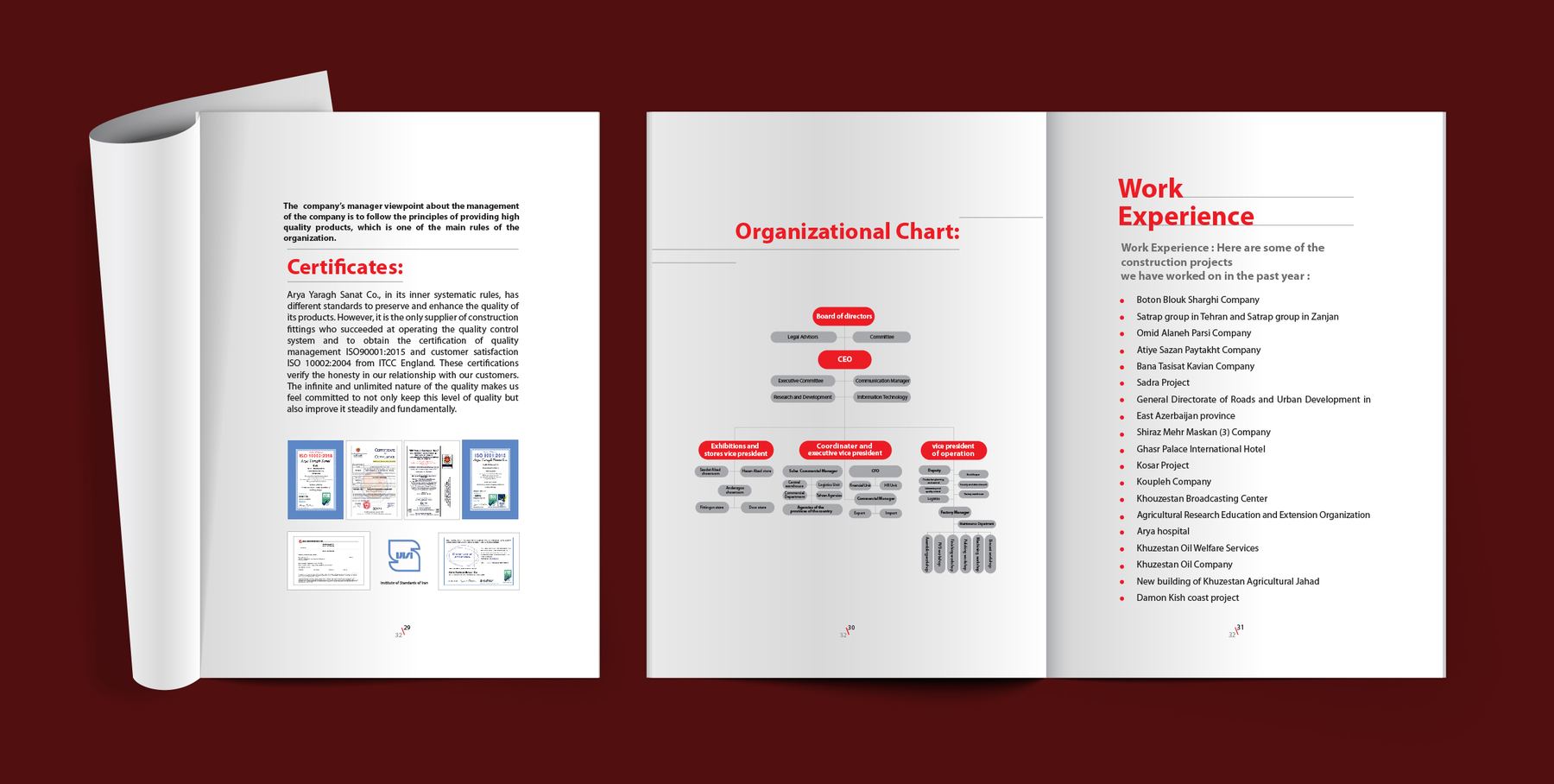
The document an industrial supplier hands over before a tender — so it has to look like a company that finishes what it starts. The cover carries a line drawing of the building rather than a photograph of it.
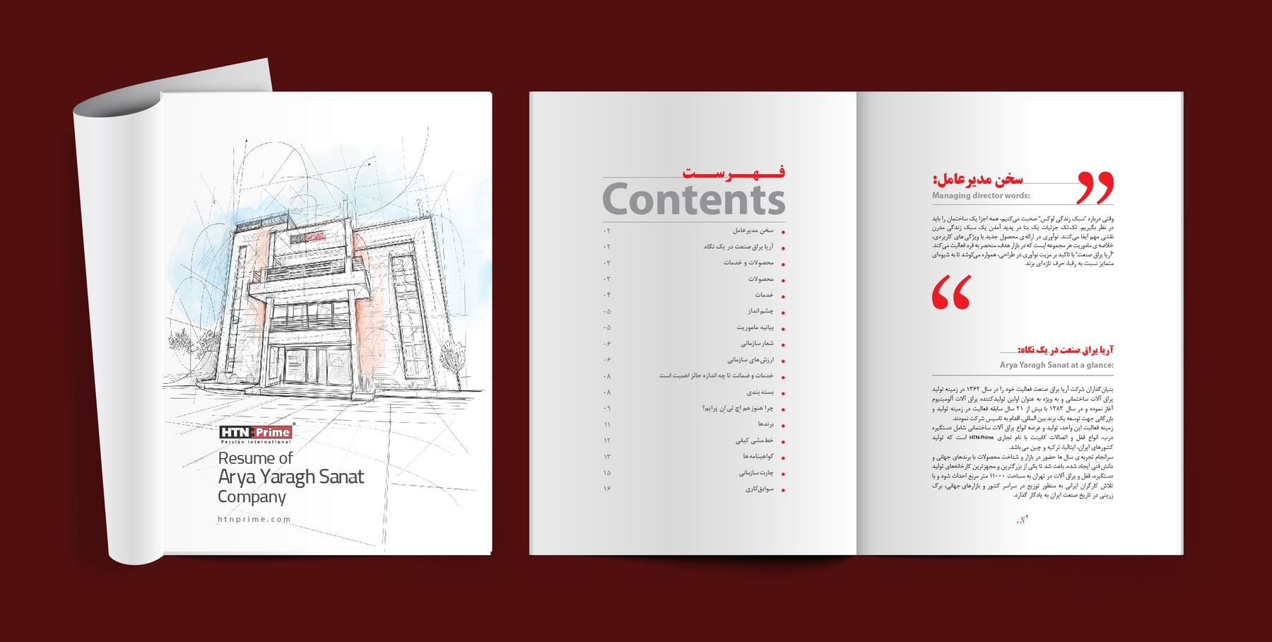
FormatCompany profile, print
ContentsQuote, certificates, org chart, track record
SettingEnglish / فارسی
Company profileOrg chart Certificate repro
Company profile cover with an architectural line drawing, contents page and red pull quoteCover & contents
Interior spreads with certificates, an organisational chart and a work experience listCertificates, chart, track record
Setayesh Ahmadi16 / 23
07 — HTN PrimeDigital

htn prime
— digital

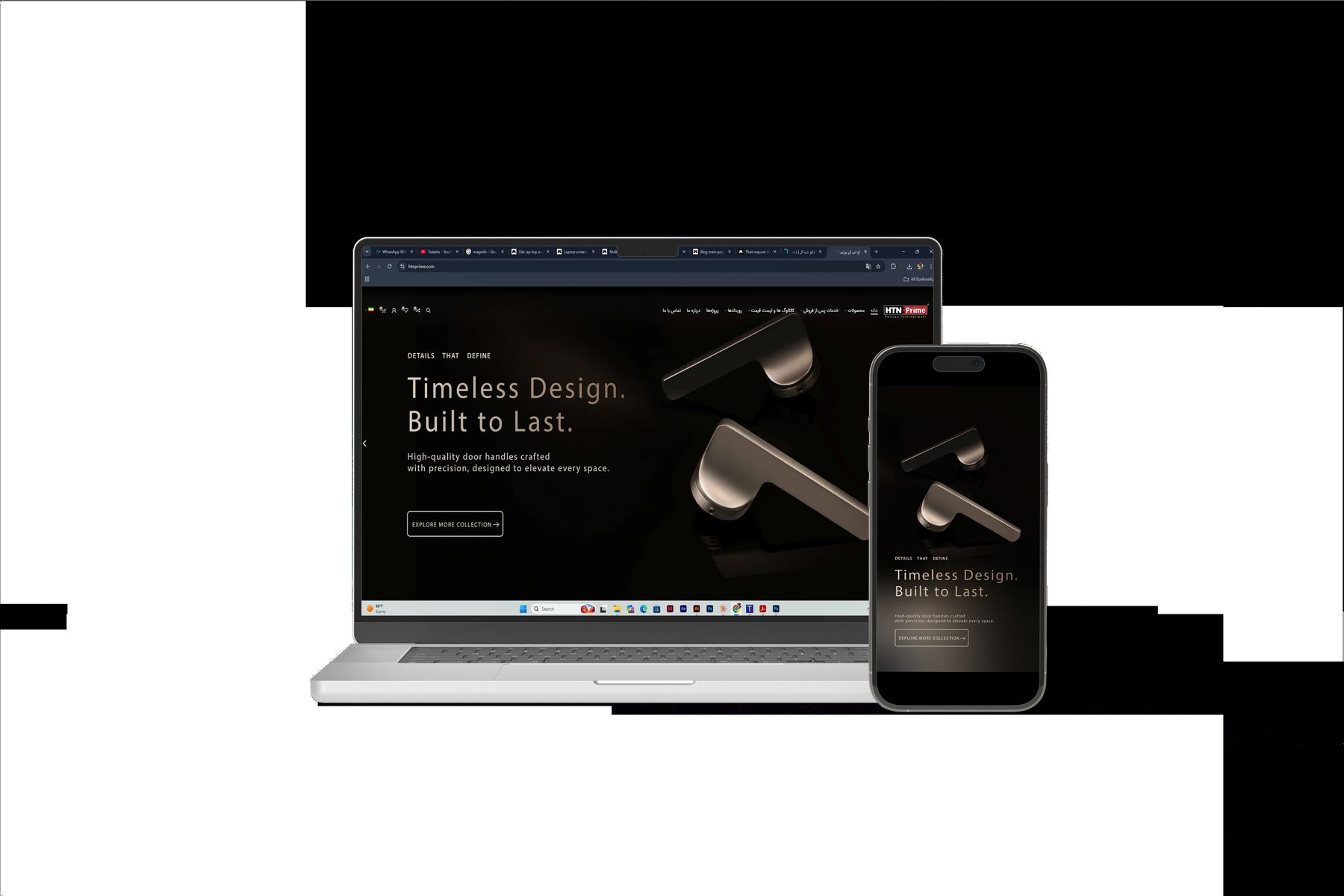
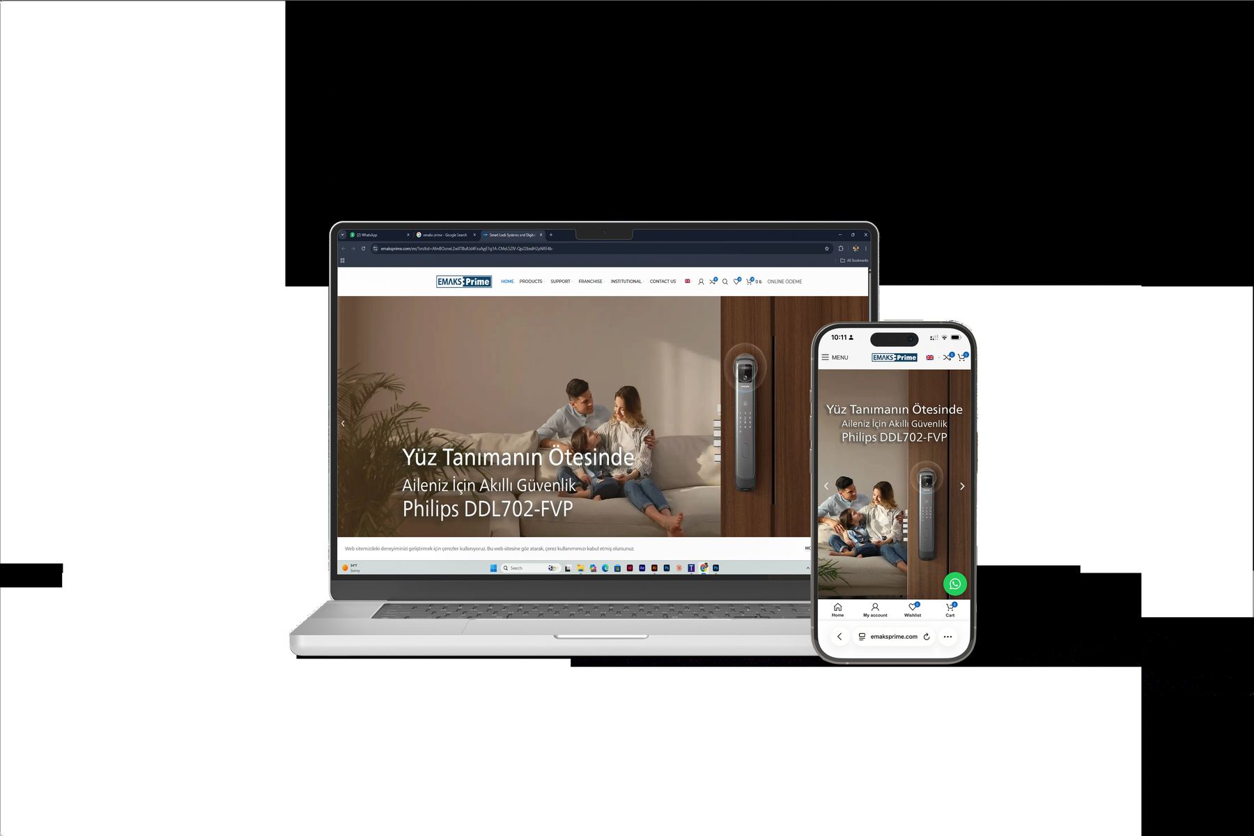
Ongoing digital content for an architectural hardware brand: landing pages built around one product at a time, dark site sections where a brushed handle can be lit like an object, spec blocks that stay readable next to a rendering.
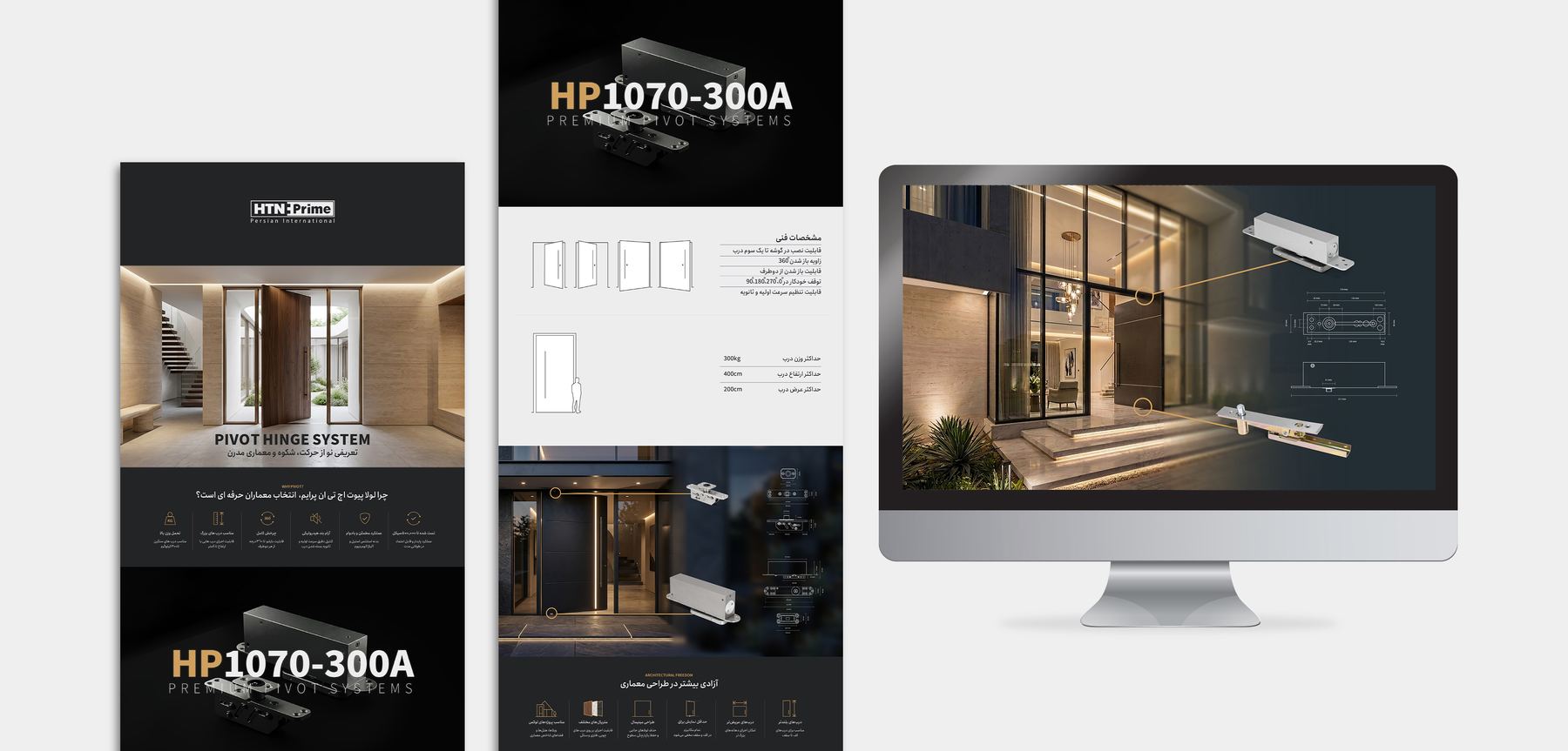
ClientHTN Prime
ScopeLanding pages, site content, social
MarketsEnglish · Turkish · Persian
Landing pageSpec layout Localised copy fit
Landing page and spec sheets for the HP1070-300A pivot hinge on a desktop screen beside dark product panelsHP1070-300A — pivot hinge
Dark product site on laptop and phone, headline Timeless Design Built to Last
Turkish-language smart lock product page on laptop and phone
Setayesh Ahmadi17 / 23
07 — HTN PrimeSocial content

story format

Two models side by side, and the difference is the message. Product social is built from the same photography and the same type as the catalog — so a post, a page and a printed spread all read as one brand.

  • 01Story & feed assets, sized per platform
  • 02Product comparisons and spec cards
  • 03Campaign carousels for launches
  • 04Persian, Turkish and English copy fit
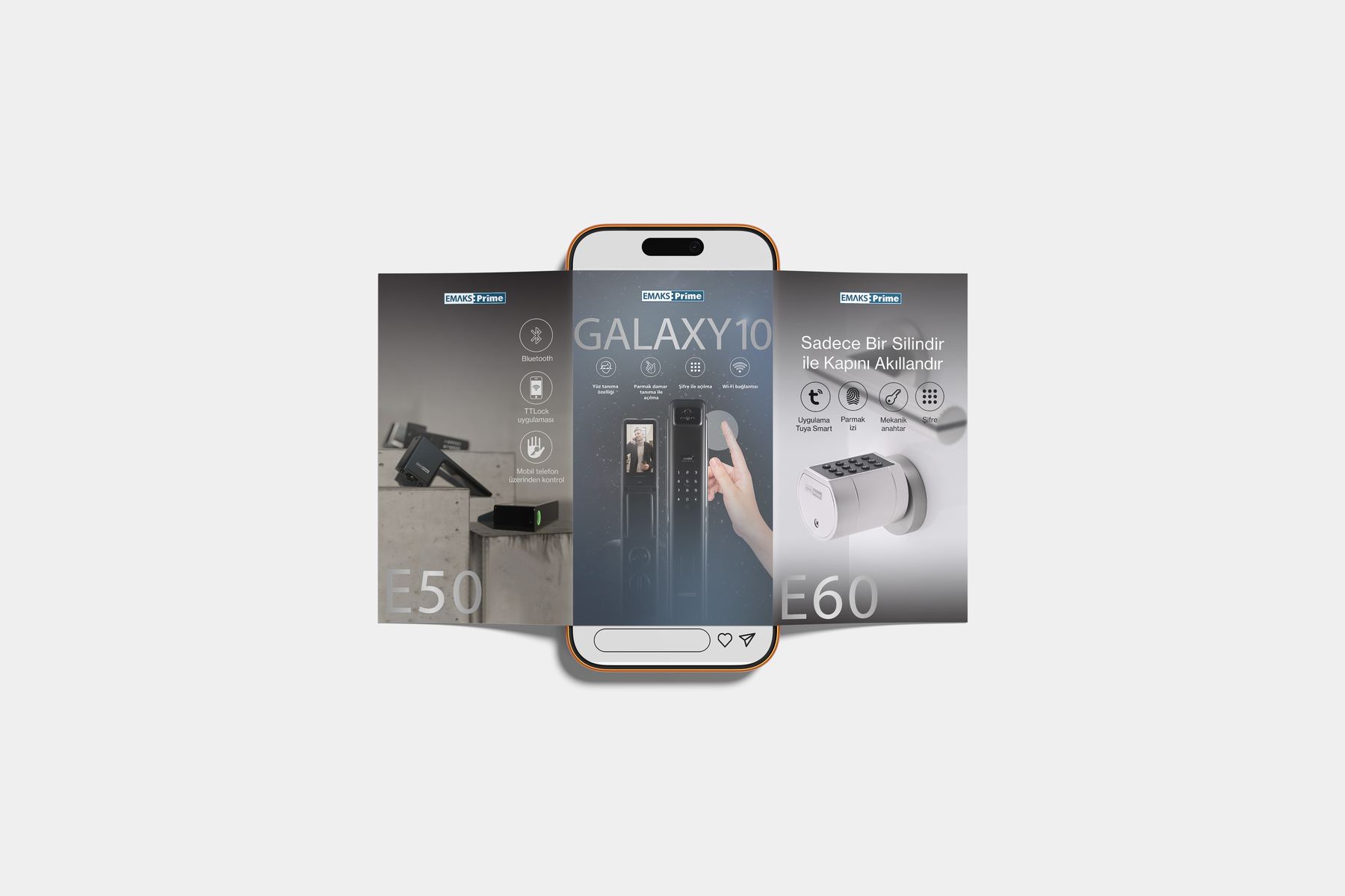
Story-format social post on a phone comparing two smart lock models side by side
Setayesh Ahmadi18 / 23
08 — The product catalogSquare, chaptered

the product catalog

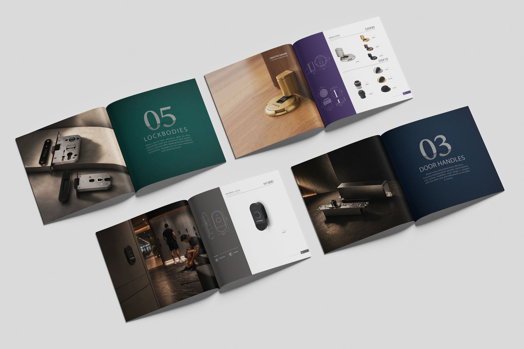
A square hardware catalog doing two jobs at once: sell an interior and list a part number. Each chapter opens on a numbered colour plate, runs through full-bleed installation photography, then hands over to white pages where the products line up as silhouettes with their dimensions.
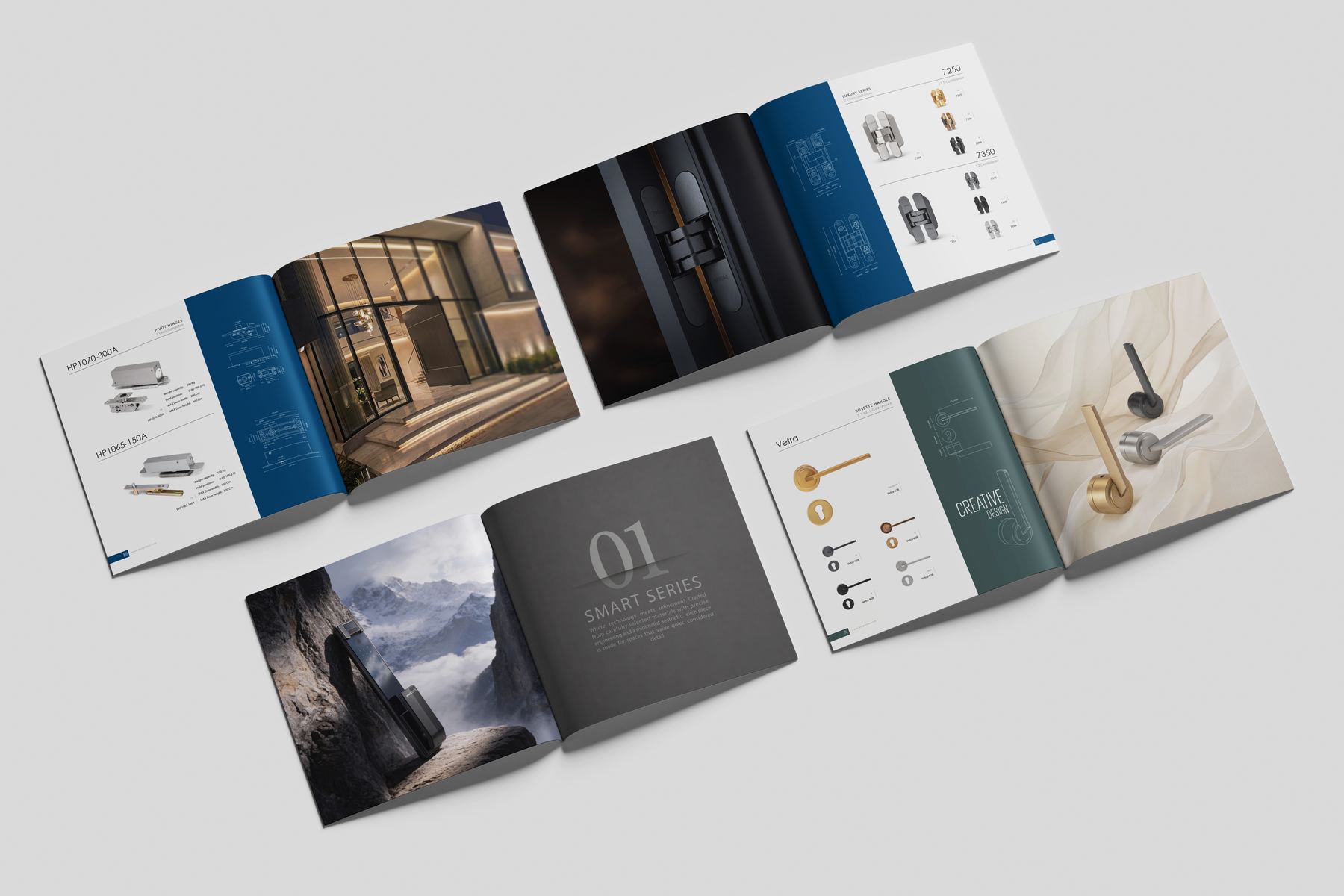
Chapters01 Smart series → 05 Lockbodies
ScopeStructure, layout, spec tables, repro
Square catalog fanned open across several spreads with numbered colour chapter openers01 — 05 · chapter openers
Catalog spreads: chapter 05 Lockbodies and chapter 03 Door Handles beside dark installation photographyInteriors & spec pages
The colour is what tells you where you are in the book.19 / 23
Tools00

tools

Print-first, with the screen tools that keep a brand consistent once it leaves the press.

Every day

  • ·Illustrator
  • ·InDesign
  • ·Photoshop
  • ·Acrobat

Also working in

  • ·Higgsfield
  • ·PowerPoint
  • ·Word

Learning

  • ·Figma
  • ·After Effects
Setayesh Ahmadi20 / 23
Experience2020 → now

Now

2024 →
HTN Prime

Since October 2024. Social content; print — catalogs, brochures, company profiles; site content including landing pages; exhibition graphics.

2021–25
Freelance

Identity, editorial and print in Persian and English. Clients included Mazandaran University and Kumu Furniture.

ATP Gallery — Munich

Gallery design work.

Before & education

2022
San'at Yar — internship

March to August 2022. First studio placement, working alongside the design team on production.

2020–24
Sooreh University

BA, Graphics. Four years in Tehran, graduating in 2024.

Now
Two years in practice

Exhibition identity, logotypes, books and Persian editorial, catalogs and profiles, trade stands, and the digital content around them.

timeline
Setayesh Ahmadi21 / 23
Working method00

how
i work

The same three moves, whether it ends up on a wall, in a binding or in a browser.

  • 01Read the material first — the photographs, the text, the part numbers. The grid comes out of what has to fit.
  • 02Set one system: a measure, a scale, a colour that means something. Then hold it.
  • 03Break it once, deliberately, where the reader should stop.
Setayesh Ahmadi22 / 23
Contact2026

thank you

Email
mynameissetayesh@gmail.com
Phone
+98 921 893 4009
Languages
فارسی / English
Open to studio work, freelance commissions and collaborations.23 / 23