setayesh
ahmadi
Working between the press, the stand and the screen — exhibition identity and trade stands, logotypes, photobooks and Persian editorial typesetting, catalogs and company profiles, and the digital content that carries them.
- Age
- 25
- Education
- Sooreh University
BA, Graphics - In practice
- 2 years
since graduating in 2024
about
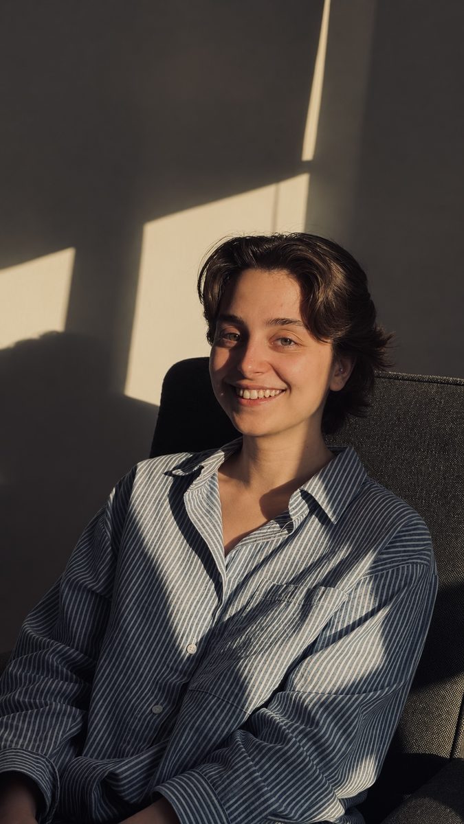
I trained in the graphics program at Sooreh University and have spent the two years since graduation moving between printed matter, built space and the screen: exhibition posters and postcards, a logotype rebrand, a black-and-white photobook, Persian literary spreads set right-to-left, catalogs and company profiles, a trade stand for Philips, and the landing pages and social content that surround a launch.
Most of my work starts in a text block. I like long Persian columns that hold their rhythm at body size, a photograph that is allowed to be quiet, and a grid strict enough that one deliberate break reads as a decision. At HTN Prime since October 2024, after four years at Sooreh and four more freelancing in Persian and English.
What I do
- Exhibition & brand identity
- Logotypes & brand systems
- Trade stands & environmental graphics
- Book and editorial design, LTR + RTL
- Catalogs, brochures & company profiles
- Social content & campaign assets
- Landing pages & site content
ali gholi ziaee
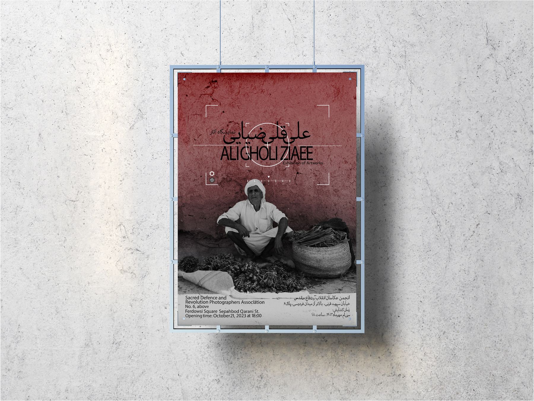
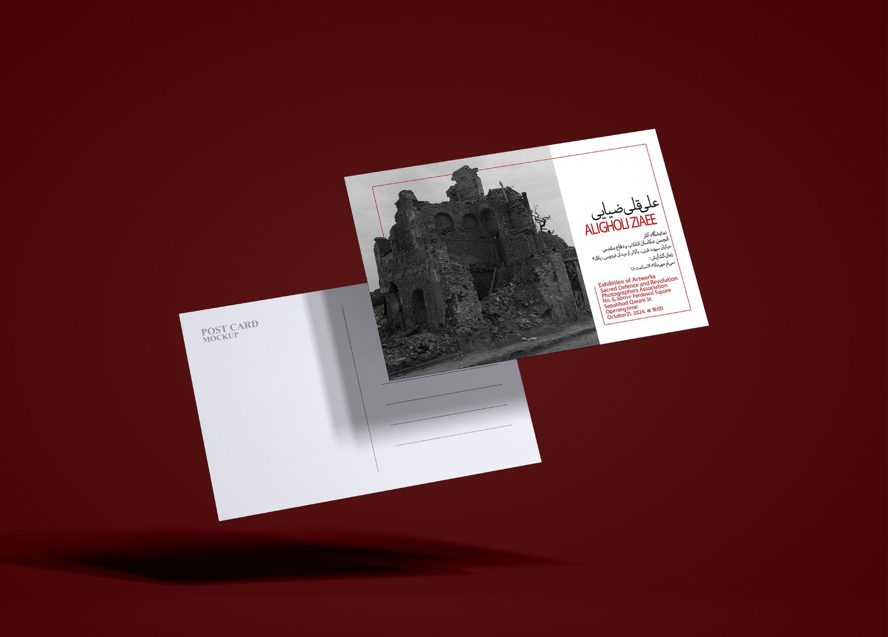
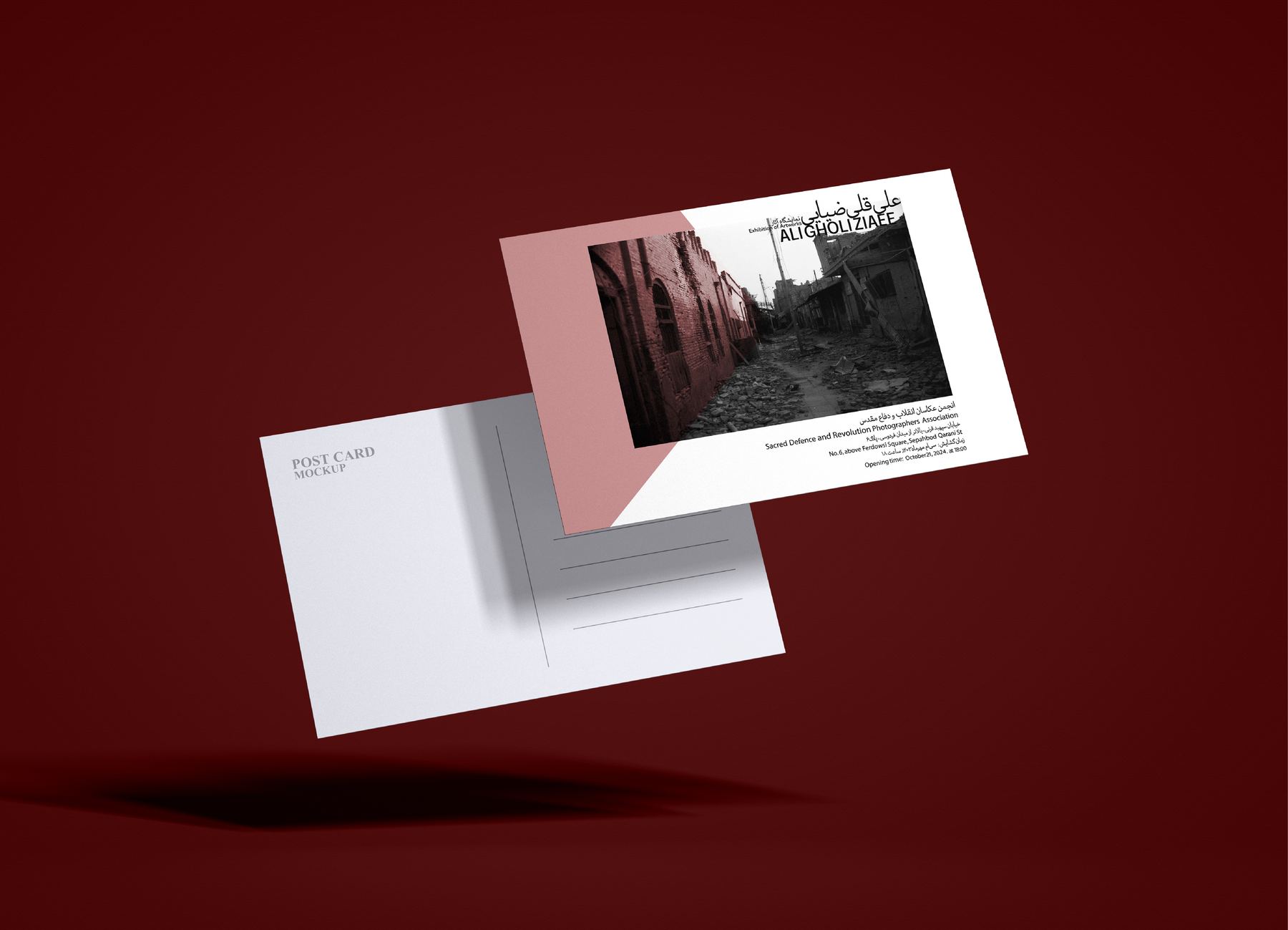
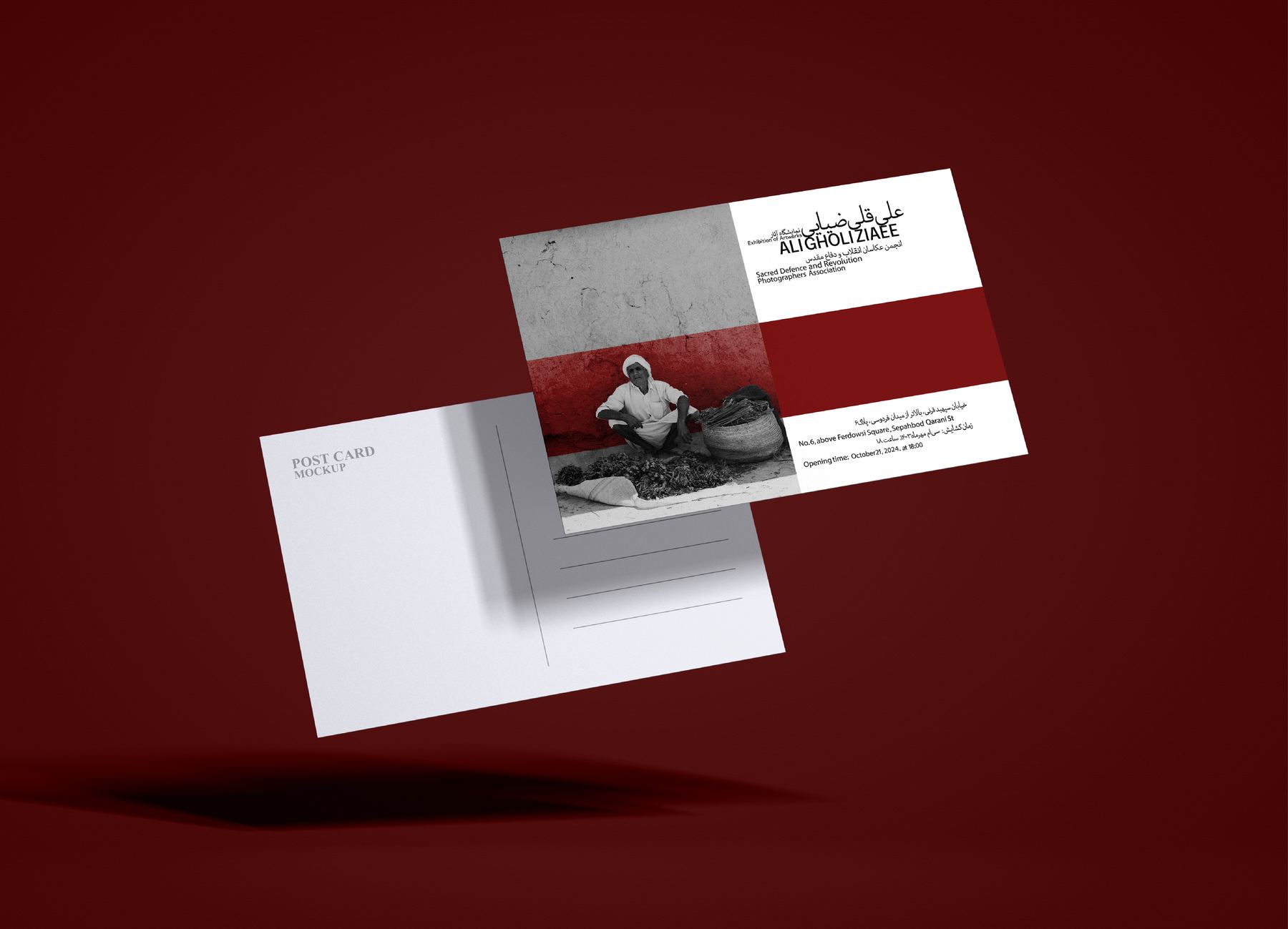
Identity for a photography exhibition, built on the photographer's own frames. Two poster routes were taken to print: one lays a thin red rule over a ruined façade and lets the bilingual title lock into the rubble line; the other drops the contrast to a rose field and centres a single working portrait between registration marks. The postcard set carries the same lockup onto oxblood stock.
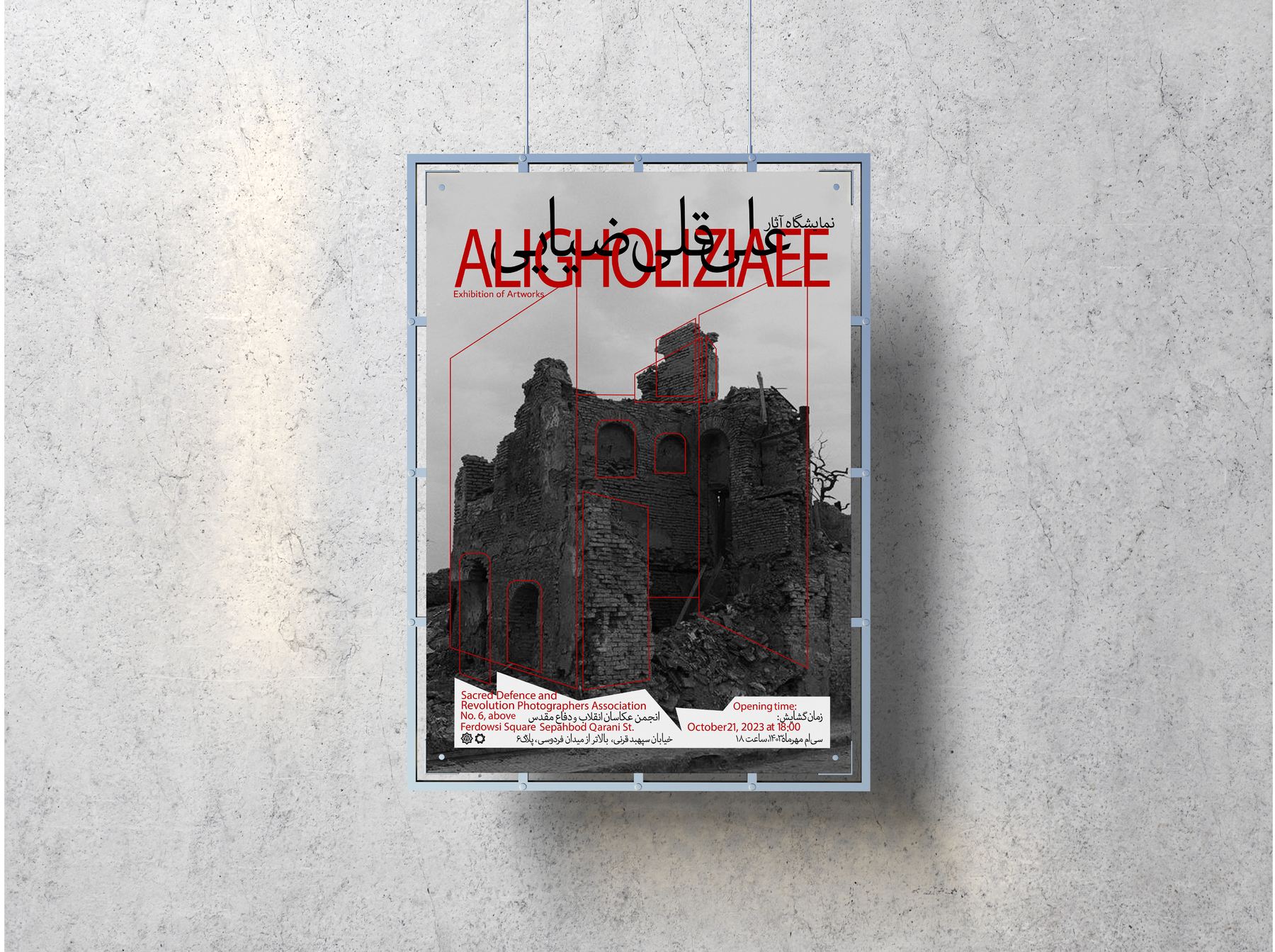
The red rule is the only thing on the sheet that isn't a photograph — so it has to do the work of a frame, a date and a signature at once.
Route A was drawn straight onto the façade: the title sits where the wall has already broken, and the thin rules pick up the lines the ruin makes on its own. Everything else — dates, venue, credits — drops to a single red-flagged block at the foot, so the poster reads as one image from across a room.
route b & the postcard set
Oxblood 100% — the colour the show was printed on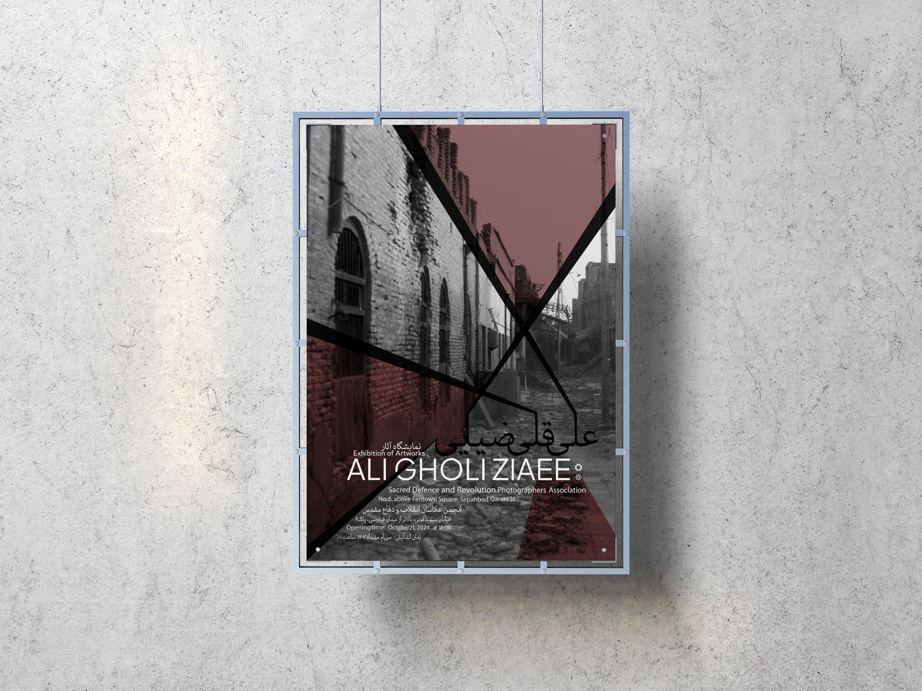
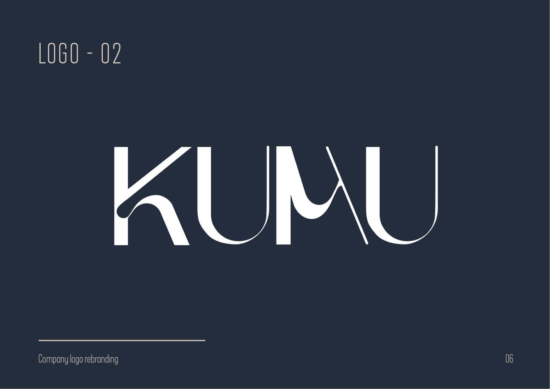
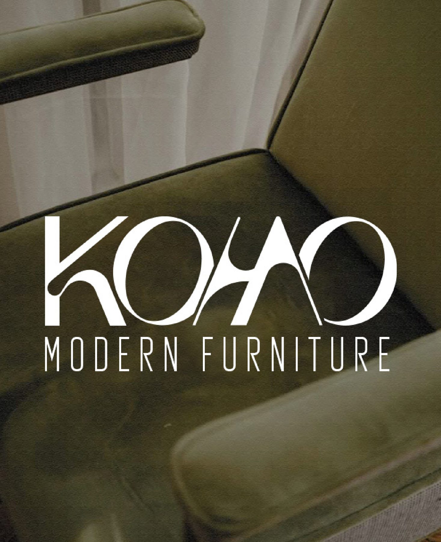
kumu
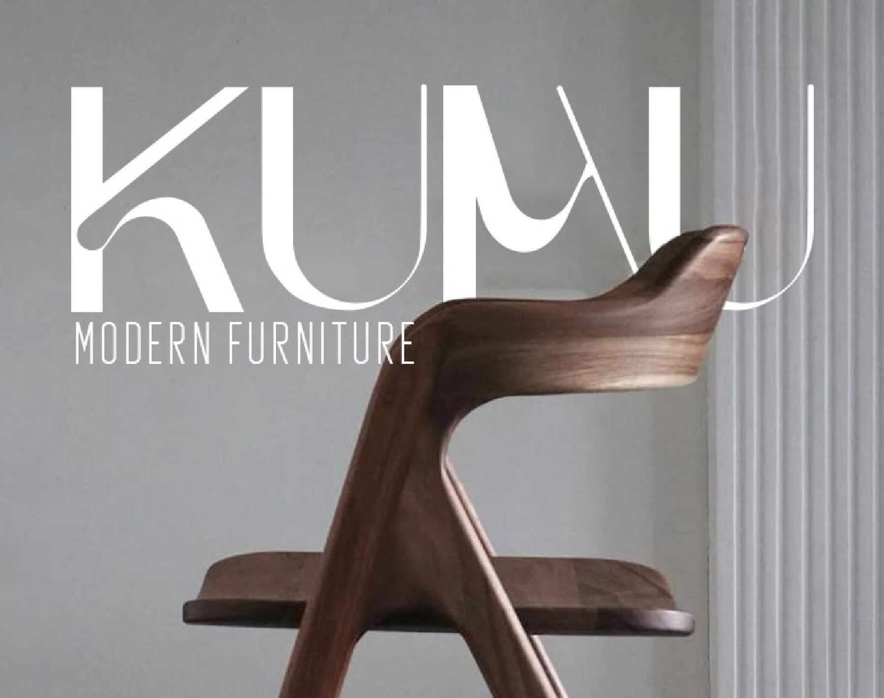
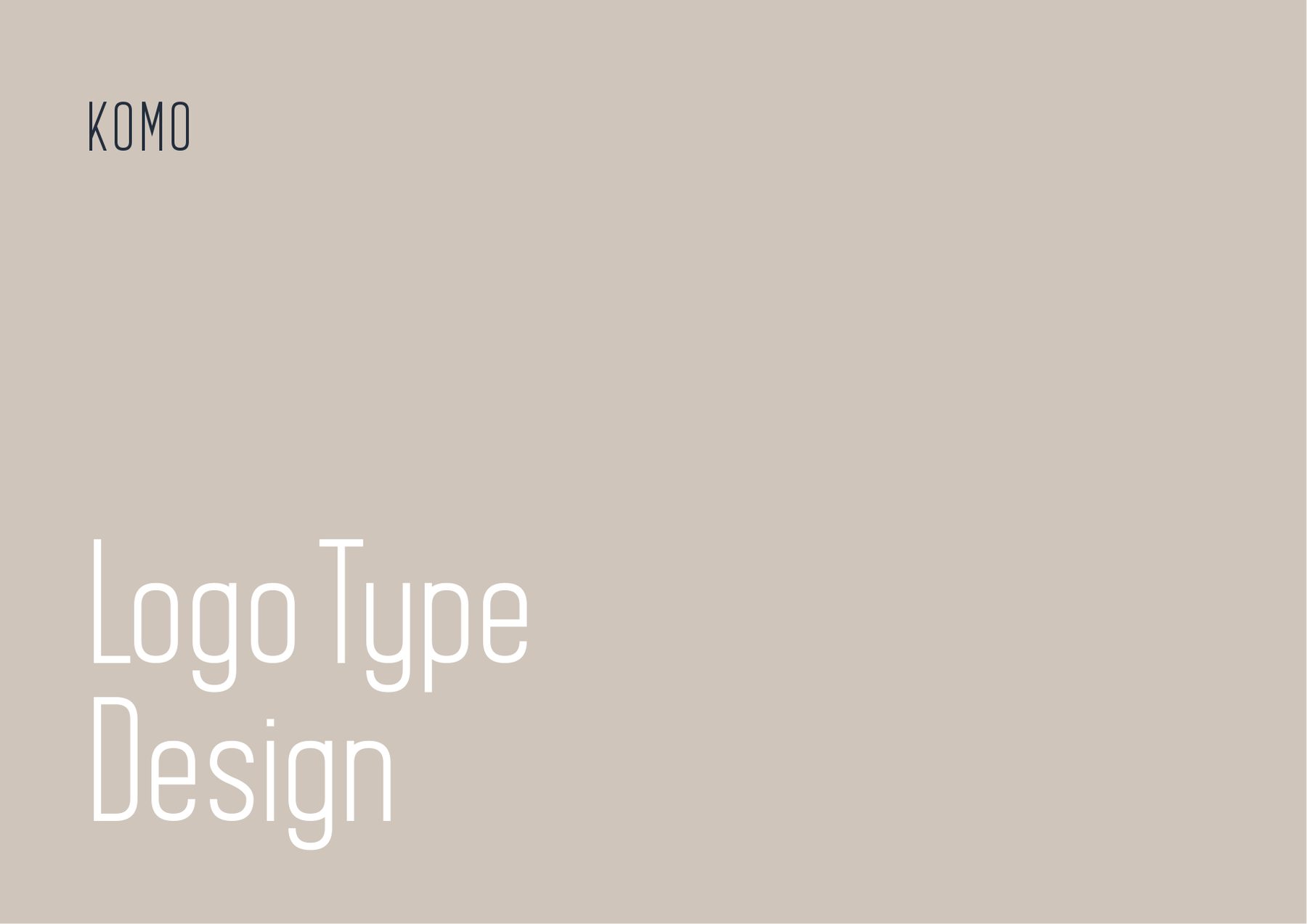
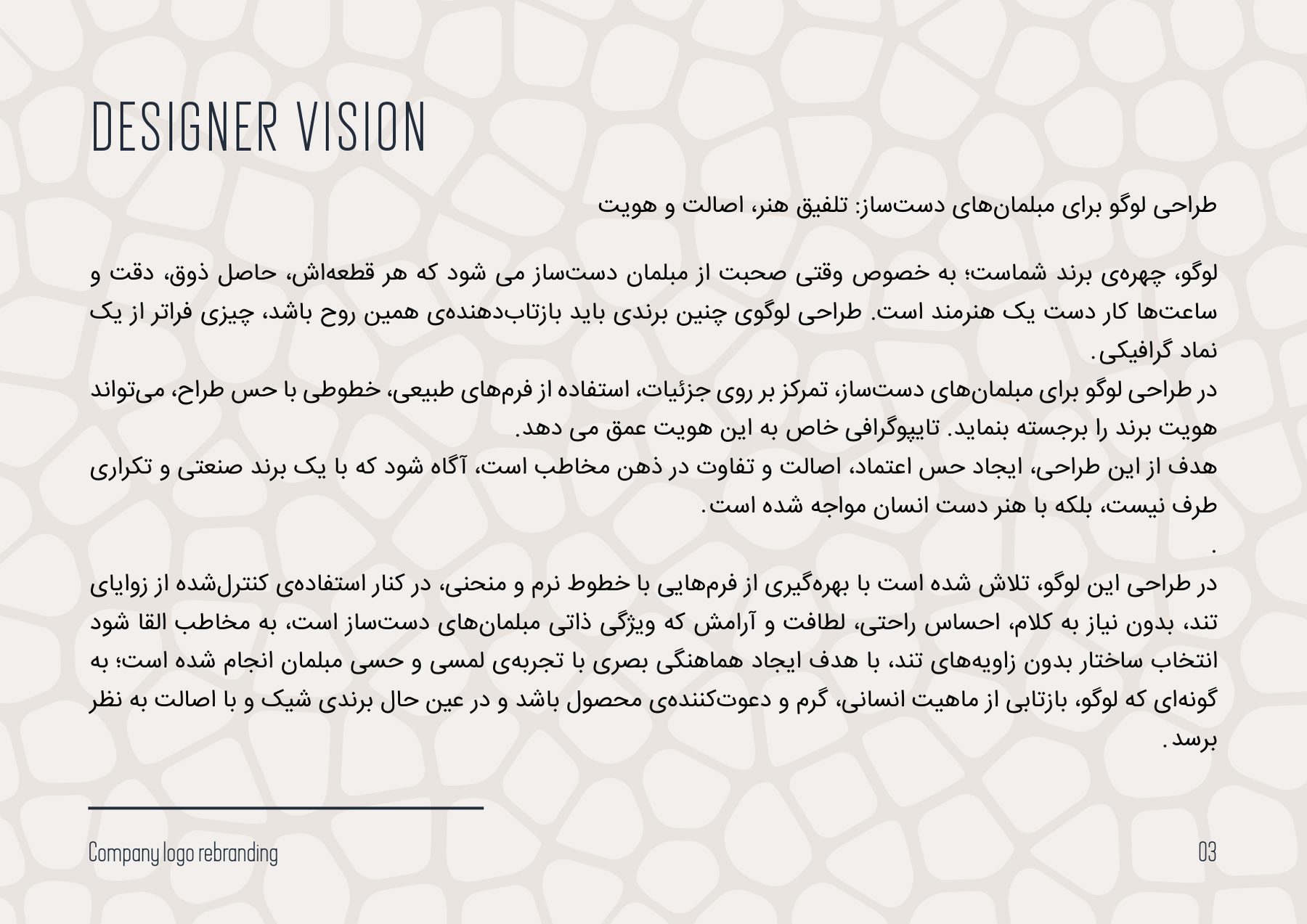
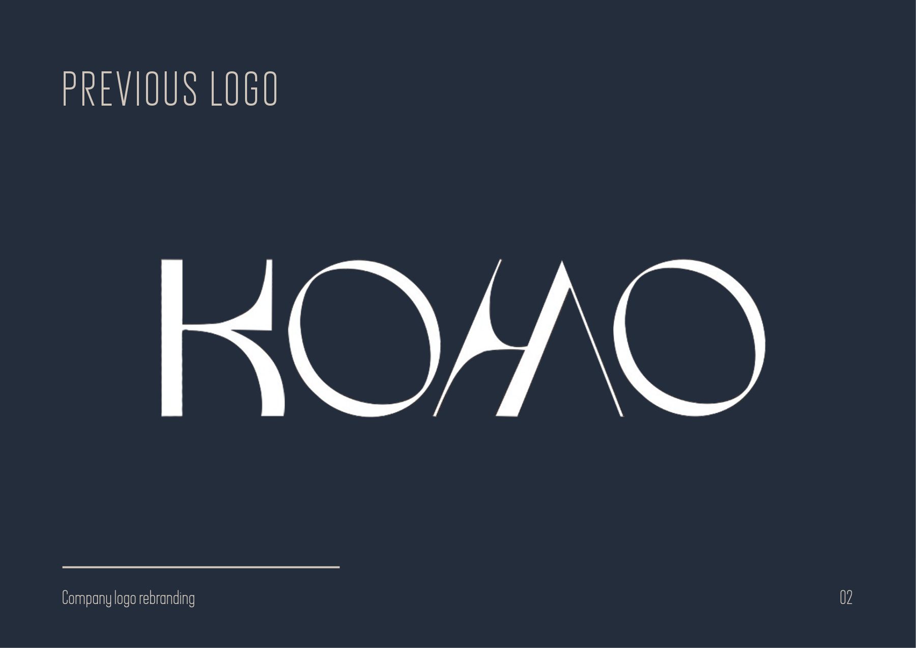
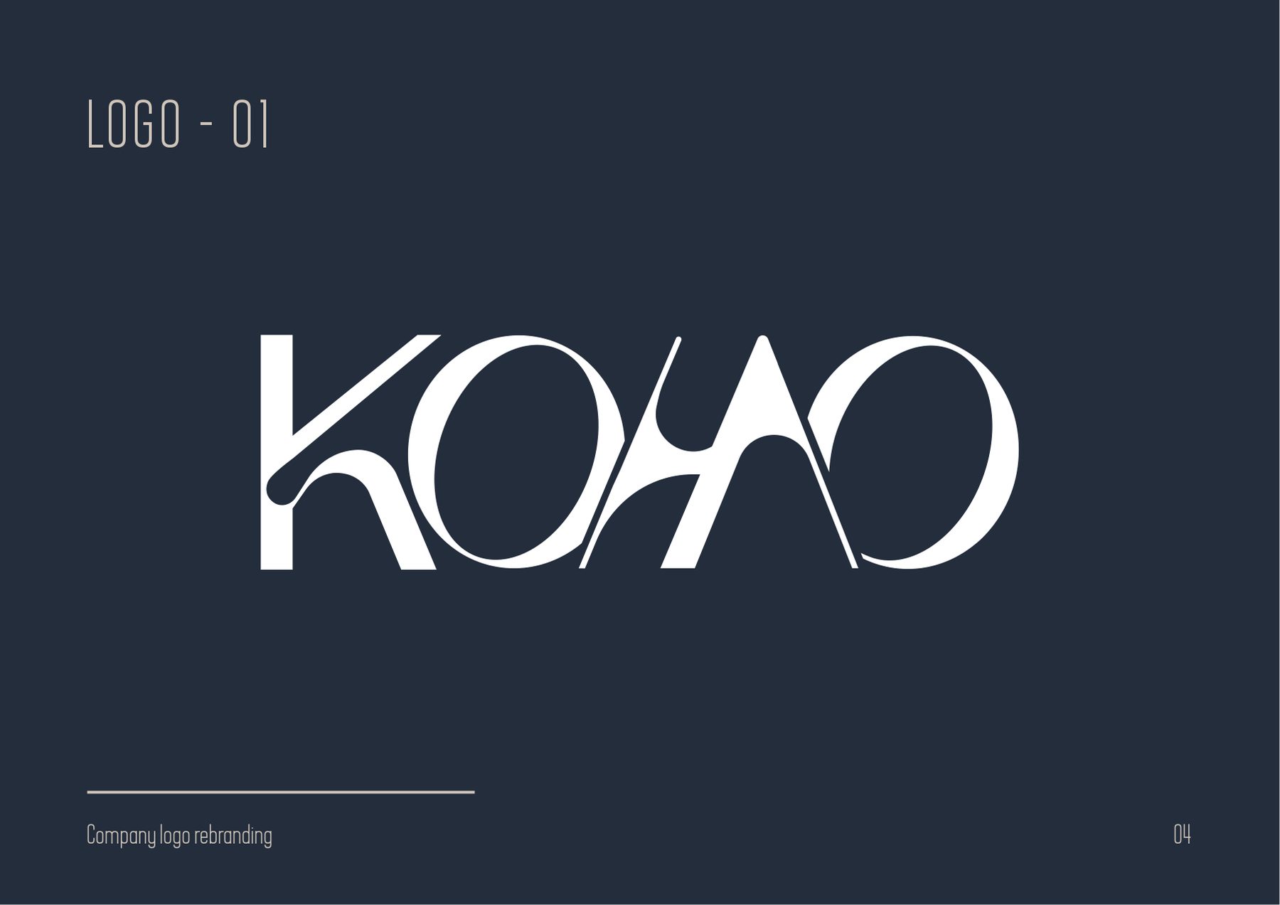
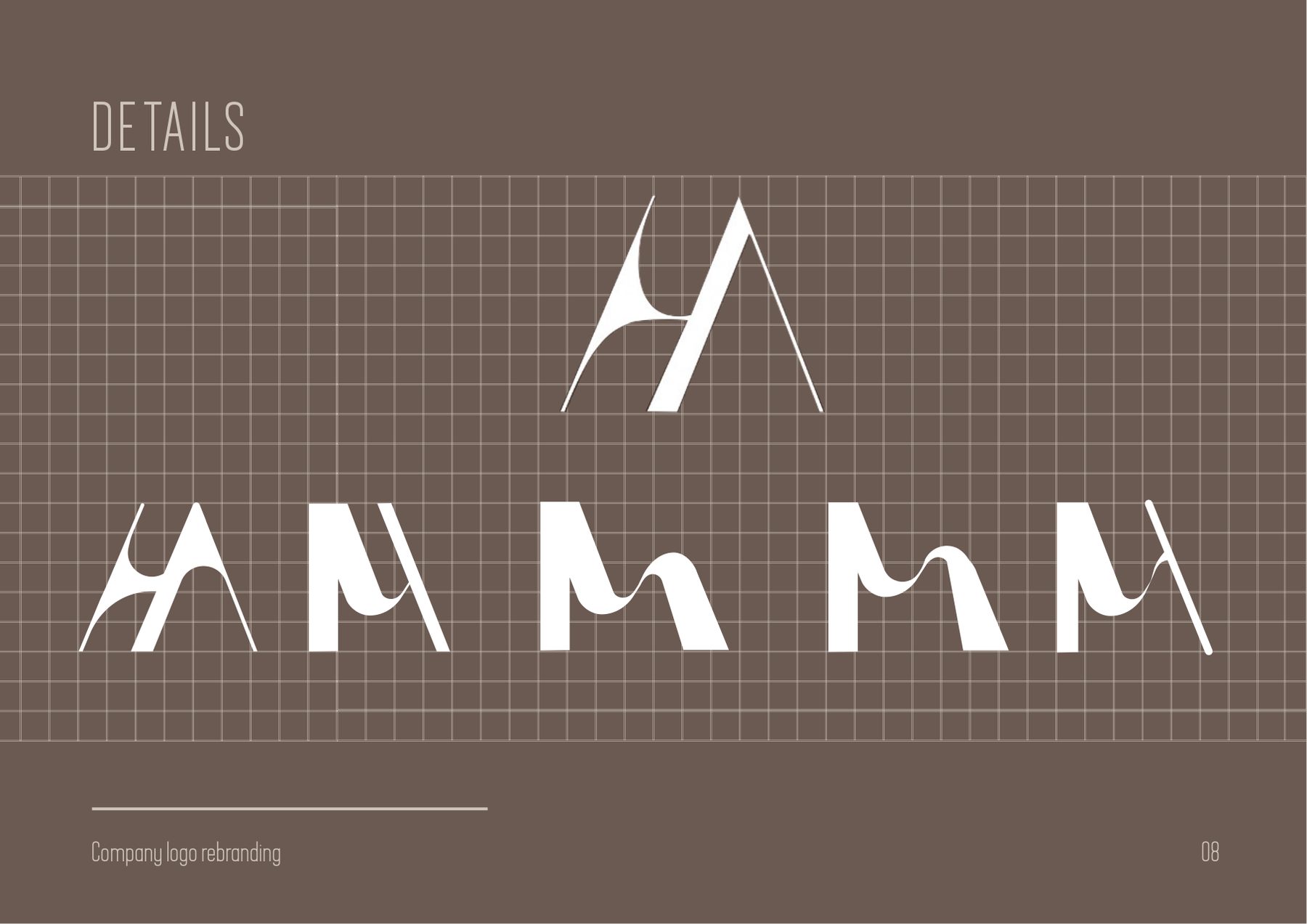
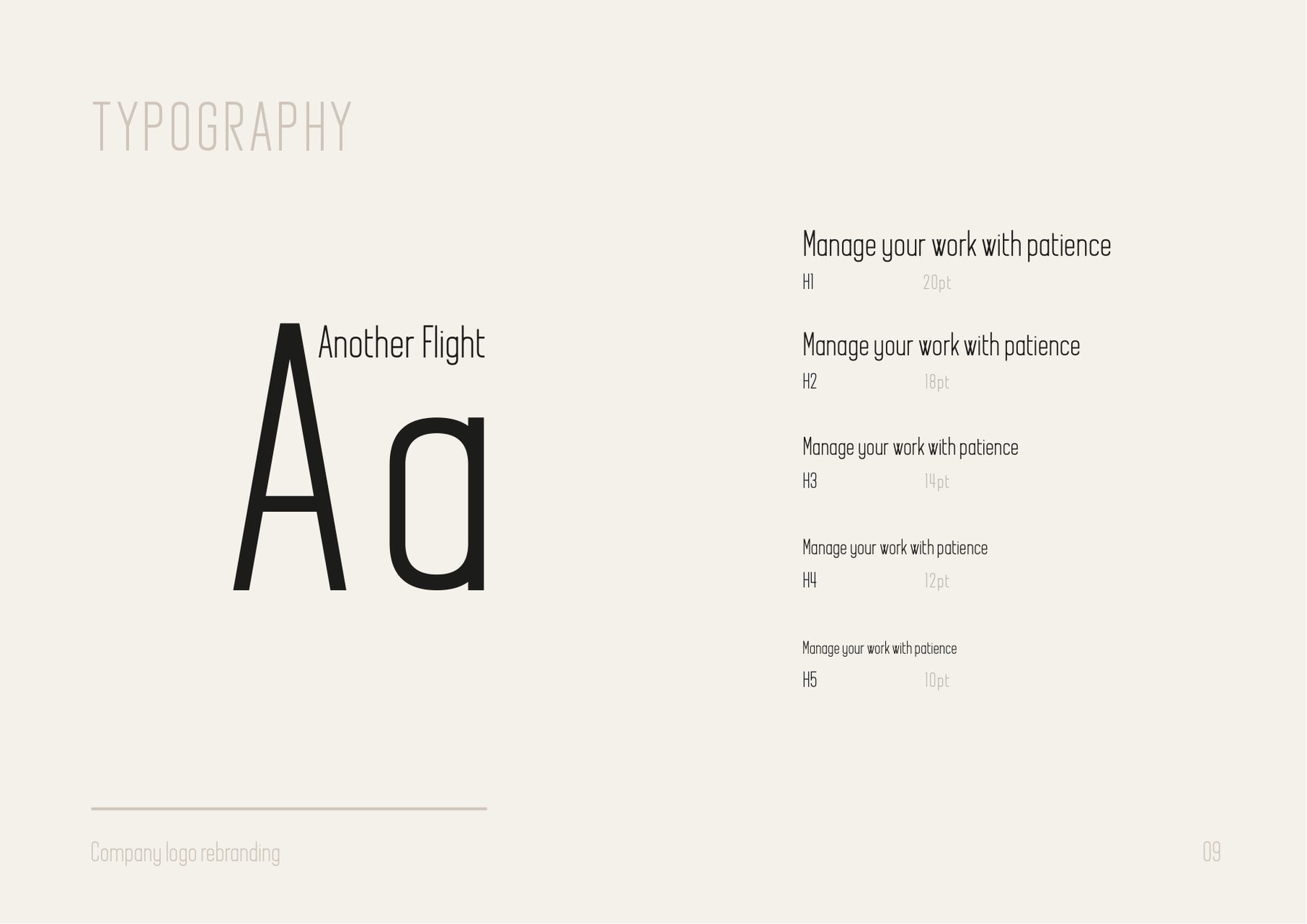
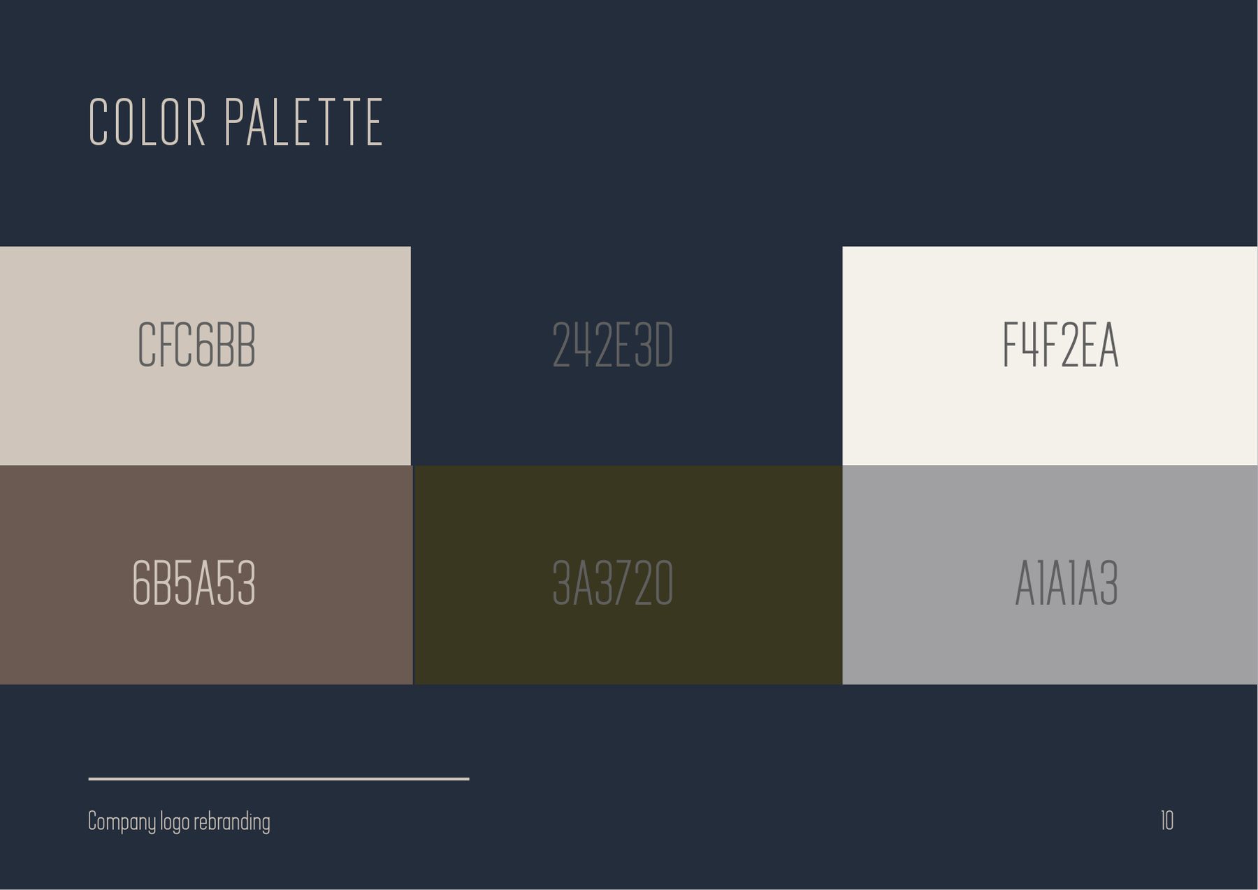
A furniture maker changing its name, and a logotype that had to change with it. The old KOMO mark already had the right instinct — wide, open, a little architectural — so the rebrand kept the instinct and rebuilt the drawing. Every letter now comes off one construction: the same angled stroke makes the K, the M and the U, which is why the word holds together when it sits over a photograph of a chair.
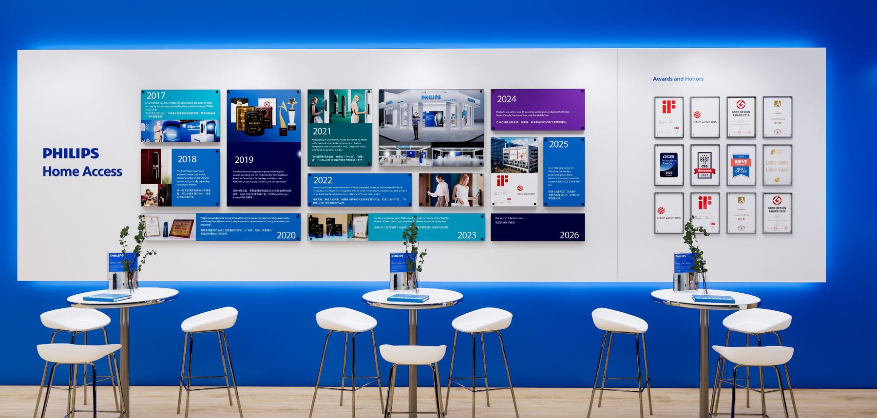
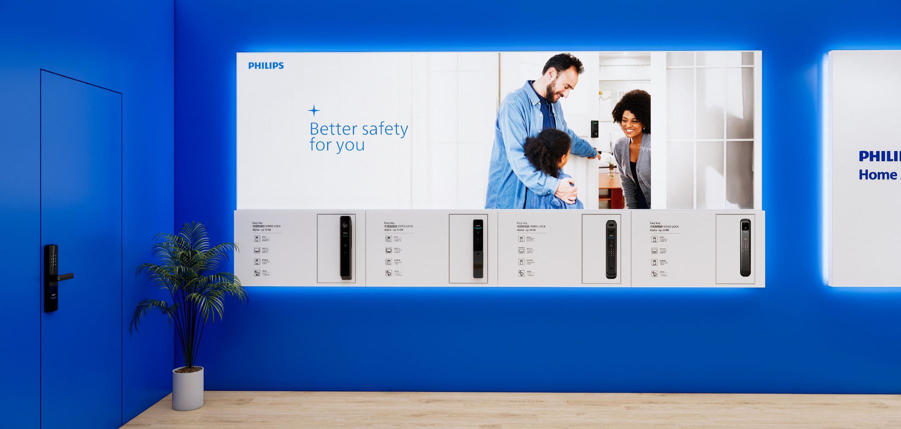
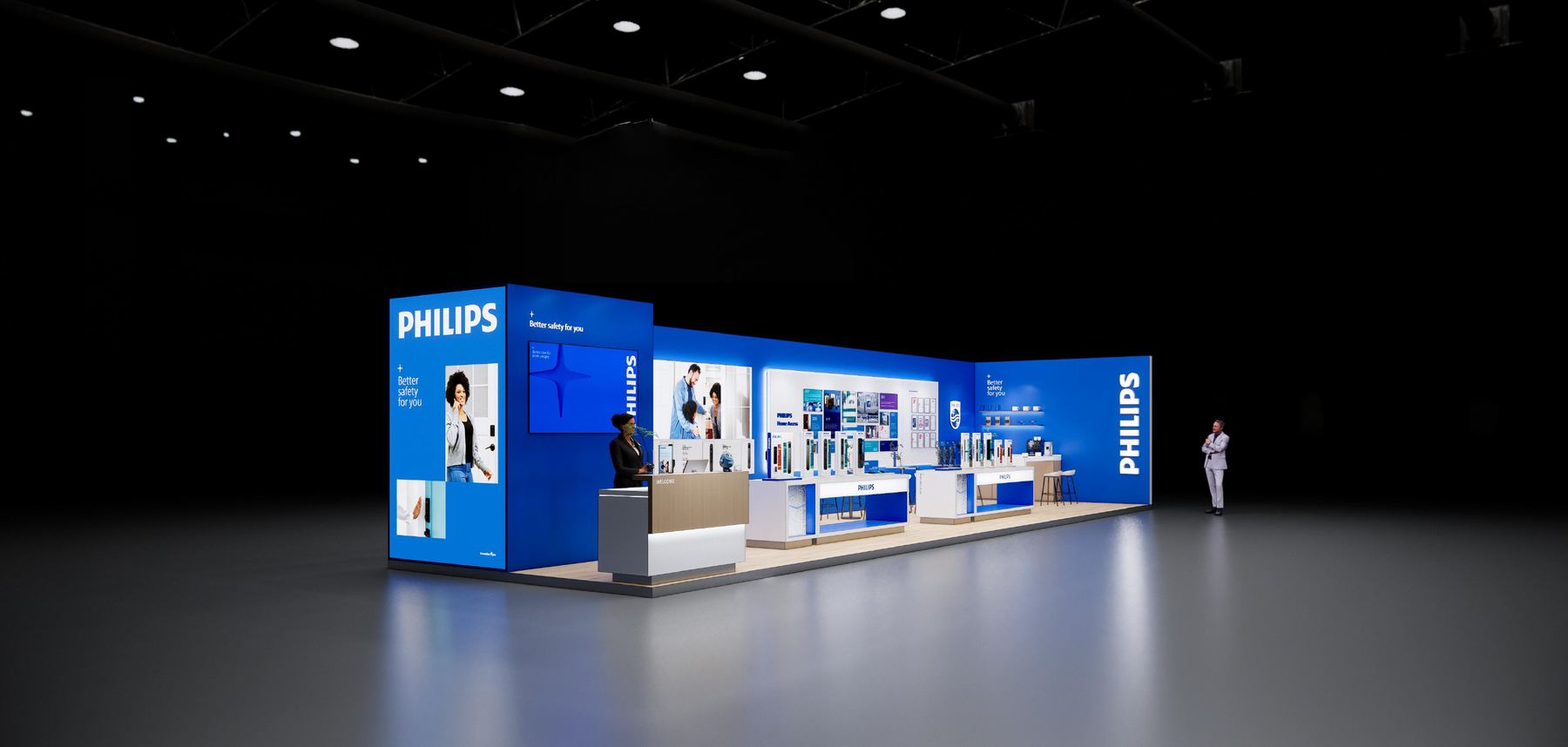
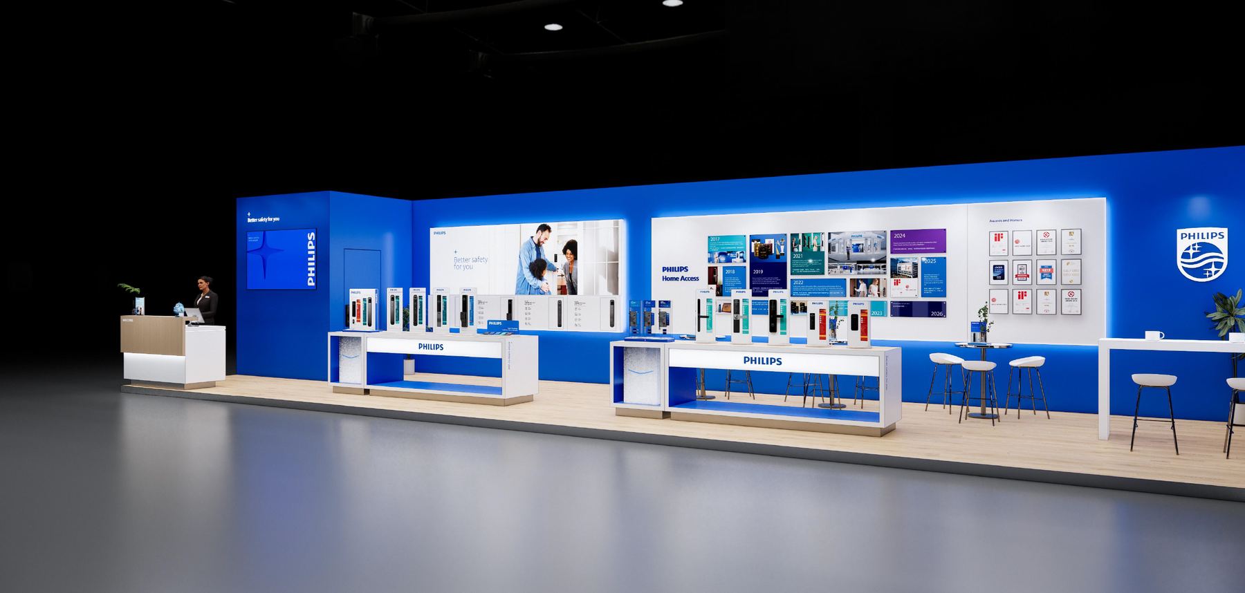
philips home access
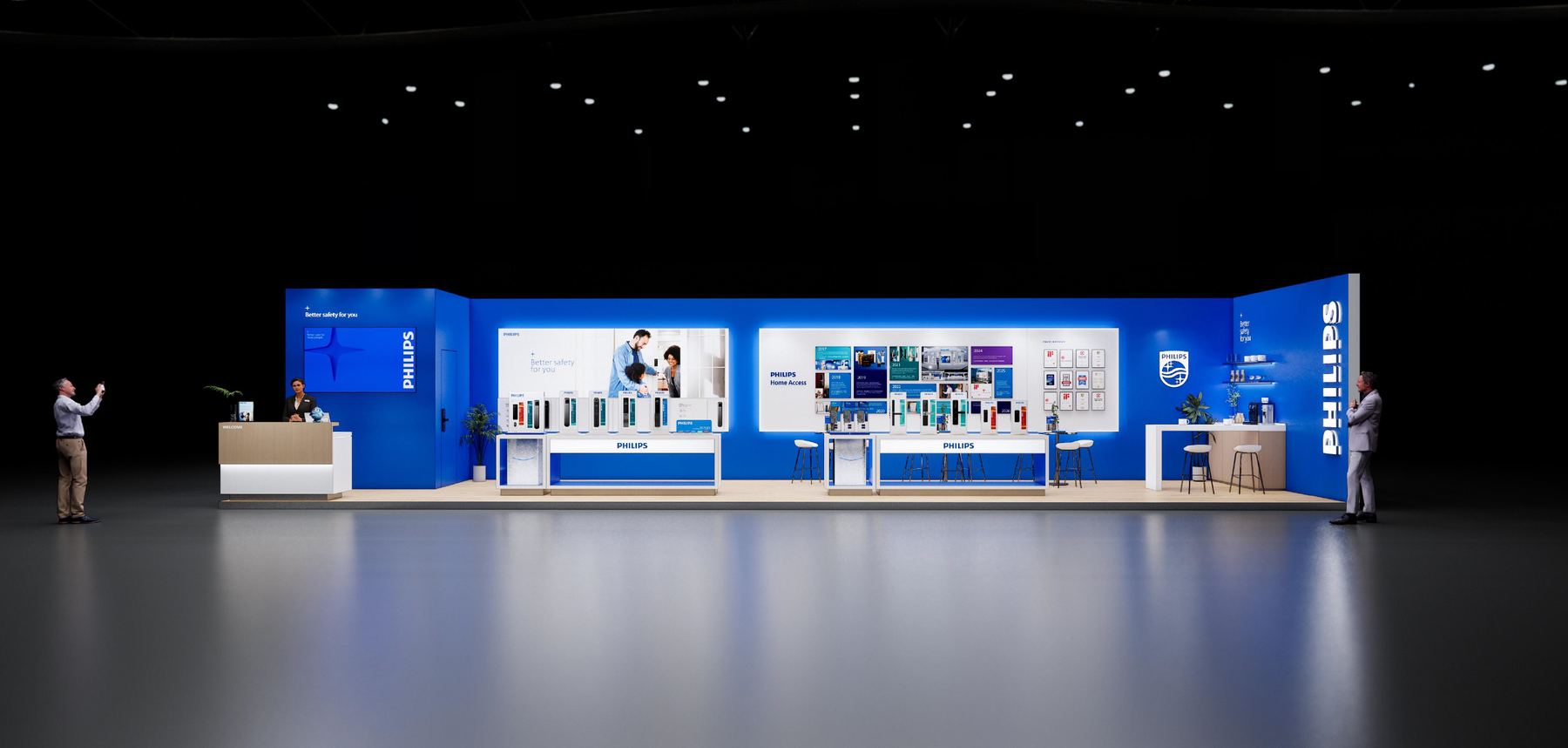
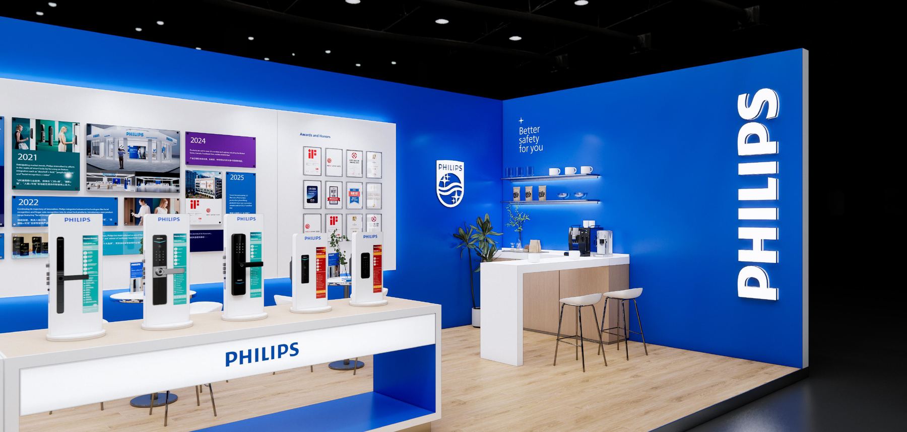
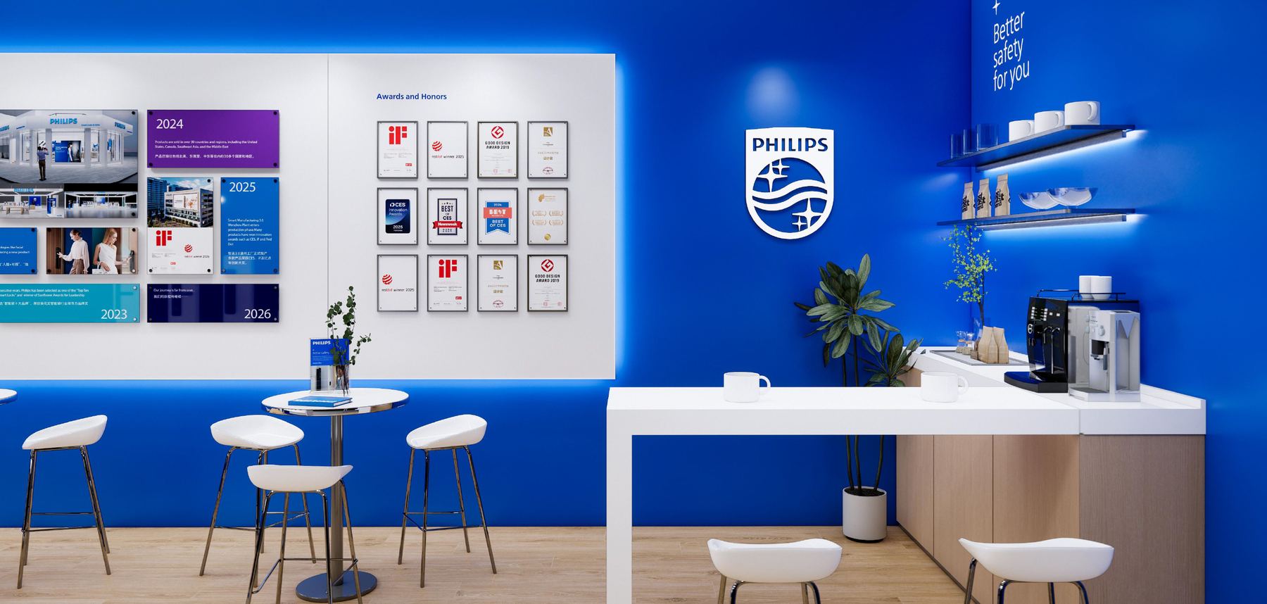
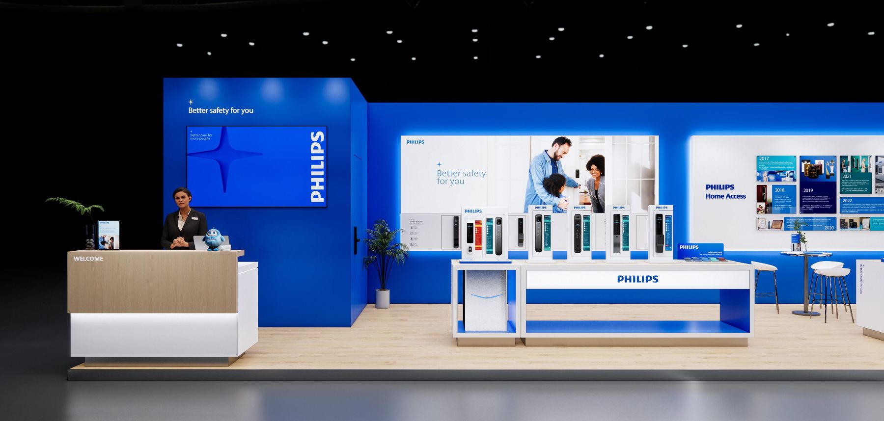
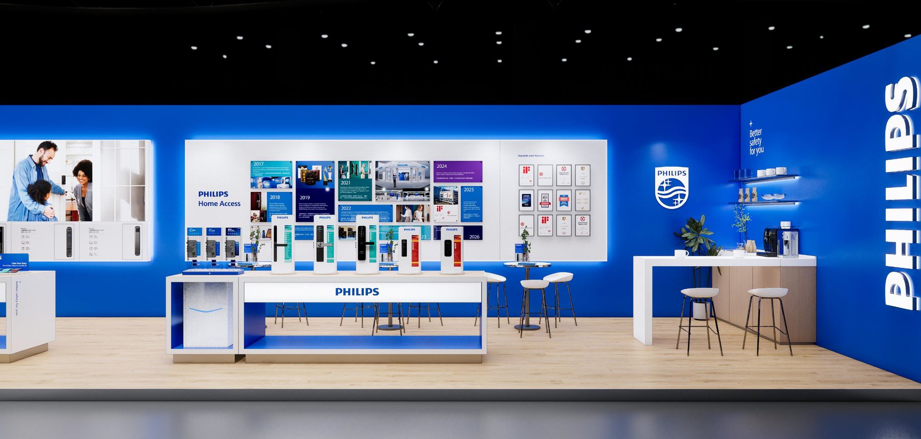
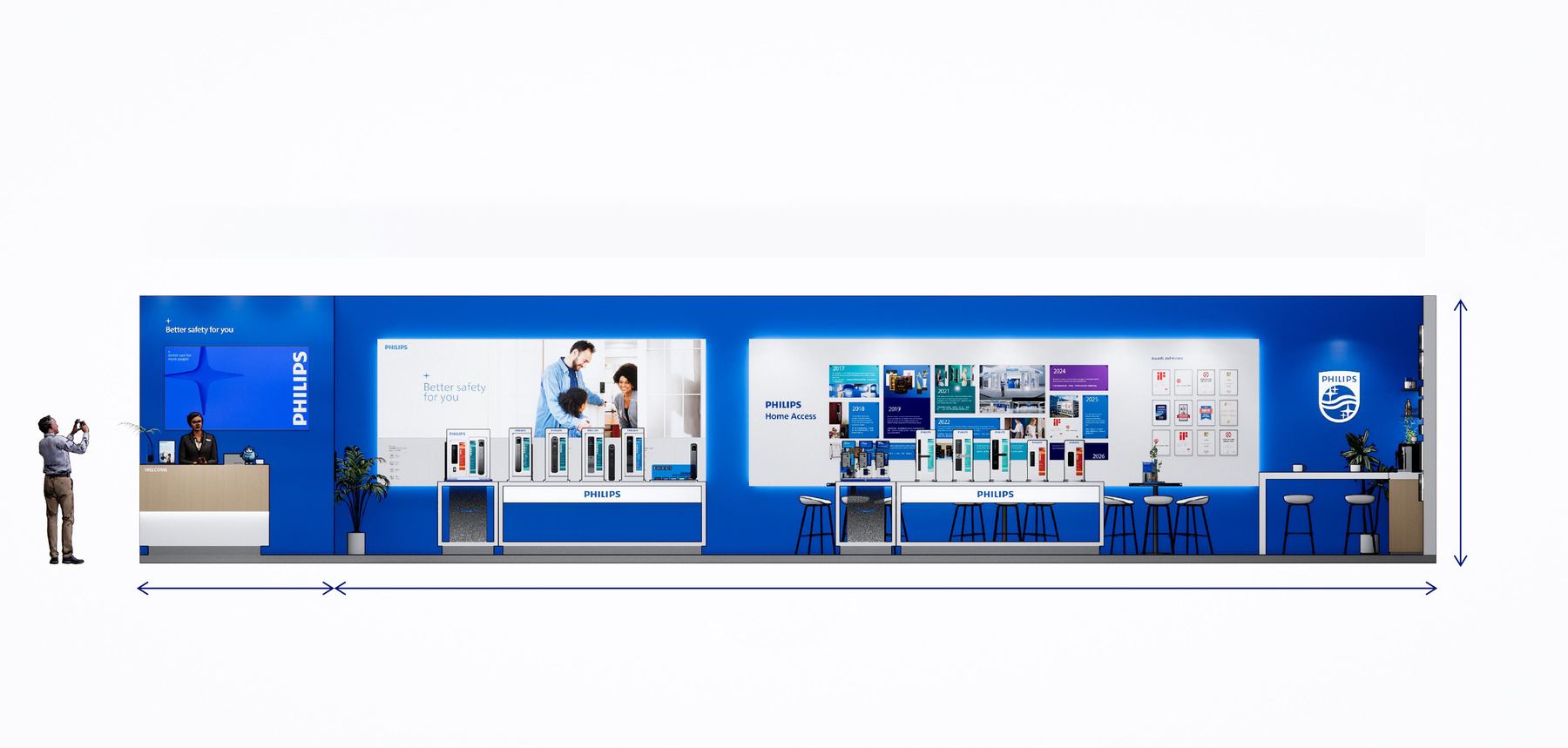
A trade stand is a brand you can walk into, and the rules change: the type has to survive being read from across a hall, and the graphics have to work as architecture. The long wall runs as one unbroken Philips blue, carrying an award timeline from 2018 to 2024; product bays step forward out of it so the locks sit at hand height, and the counter and stools hold the far end open for the conversations that are the point of being there at all.
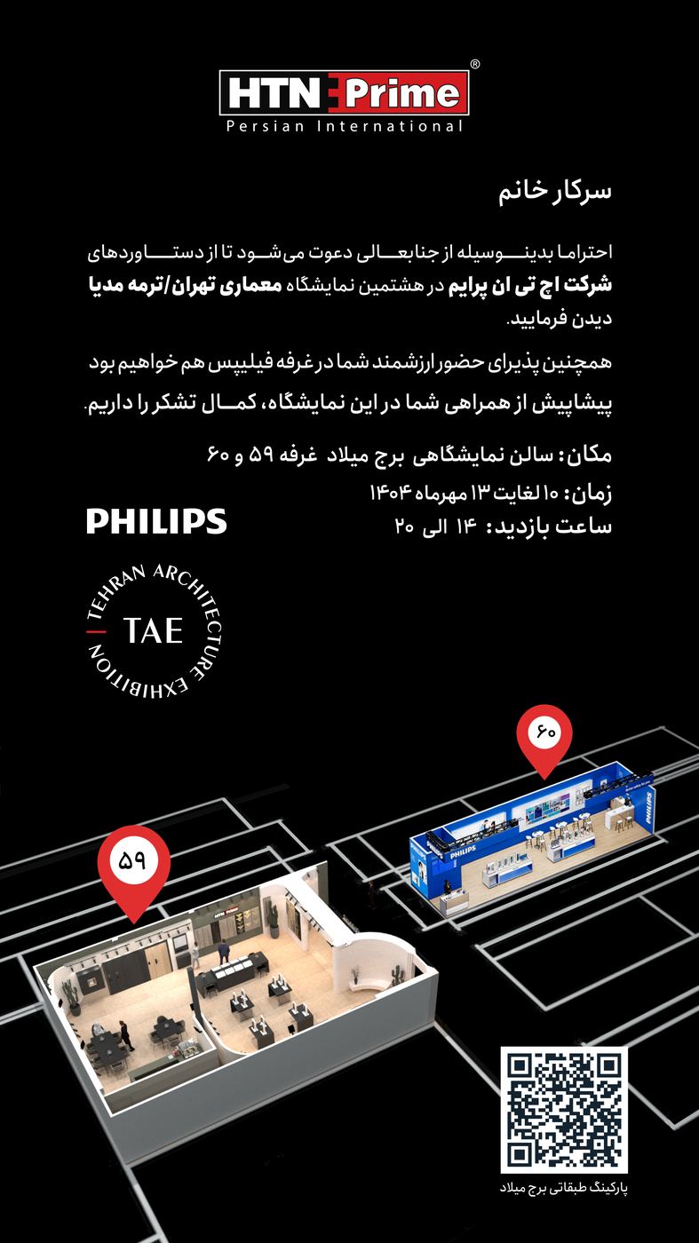
An invitation has one job that a poster doesn’t: it has to get someone across a city and into a specific booth.
So the bottom third isn’t decoration — it’s a rendered floor plan with the two stands pinned on it and a QR code beside them. Above that, the type stays out of the way: black ground, one weight of white Persian text, the HTN Prime and Philips lockups given room to be recognised at a glance in a message thread. Set for the 8th Tehran Architecture Exhibition at Milad Tower, booths 59 and 60.
the photobook
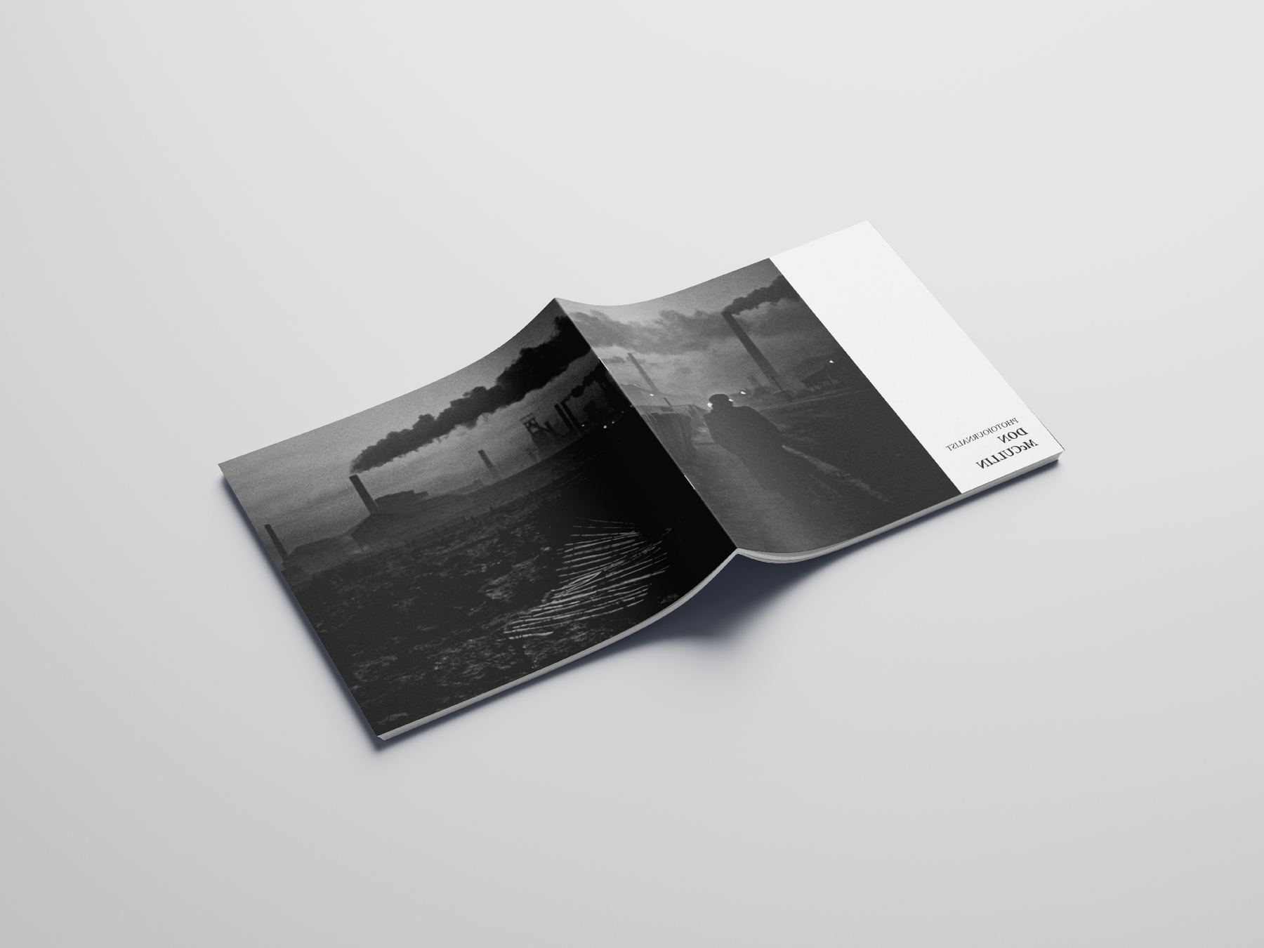
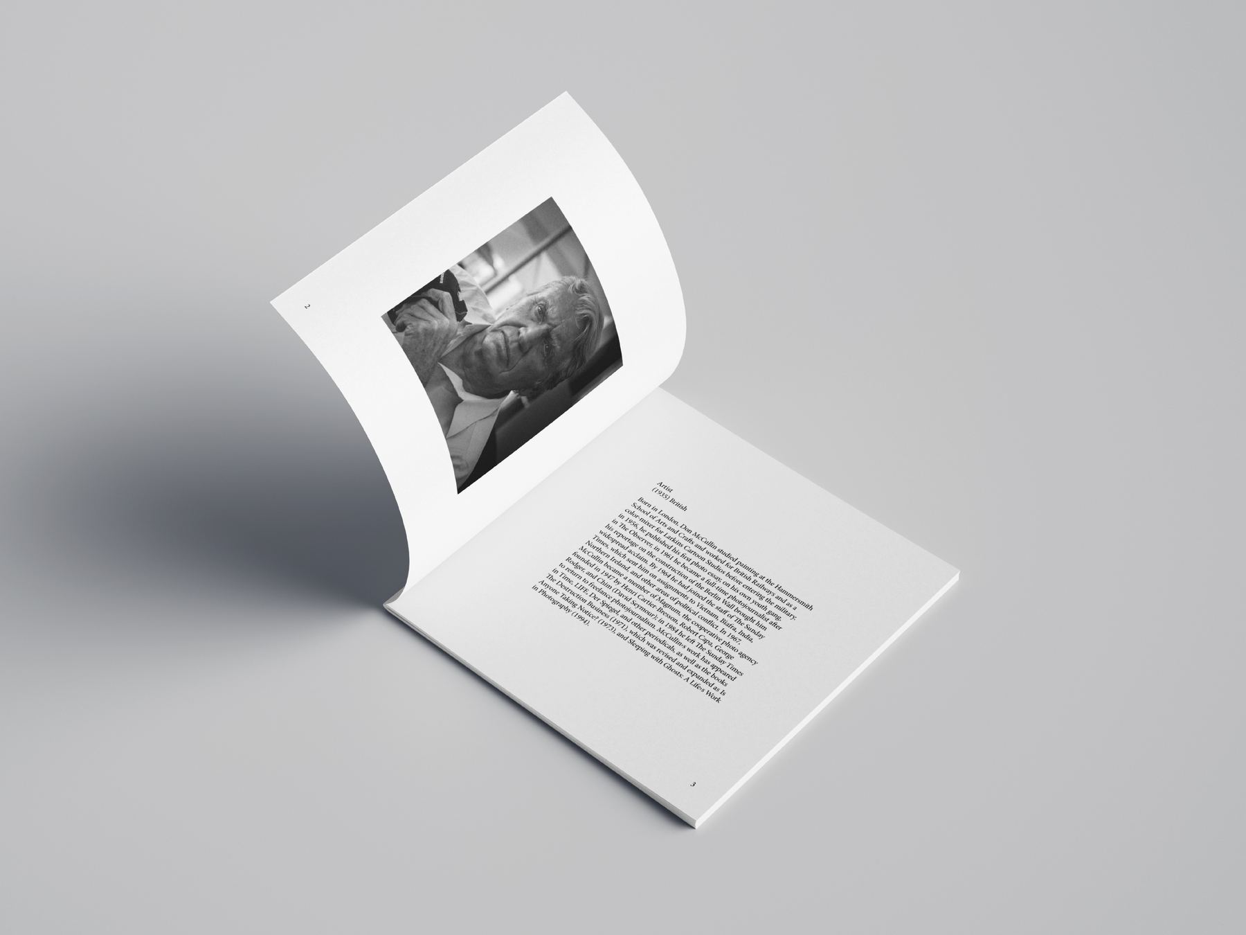
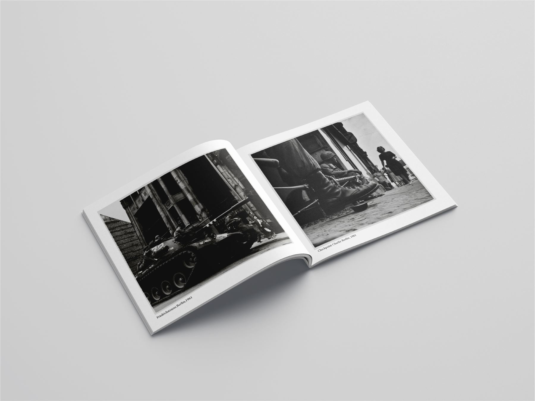
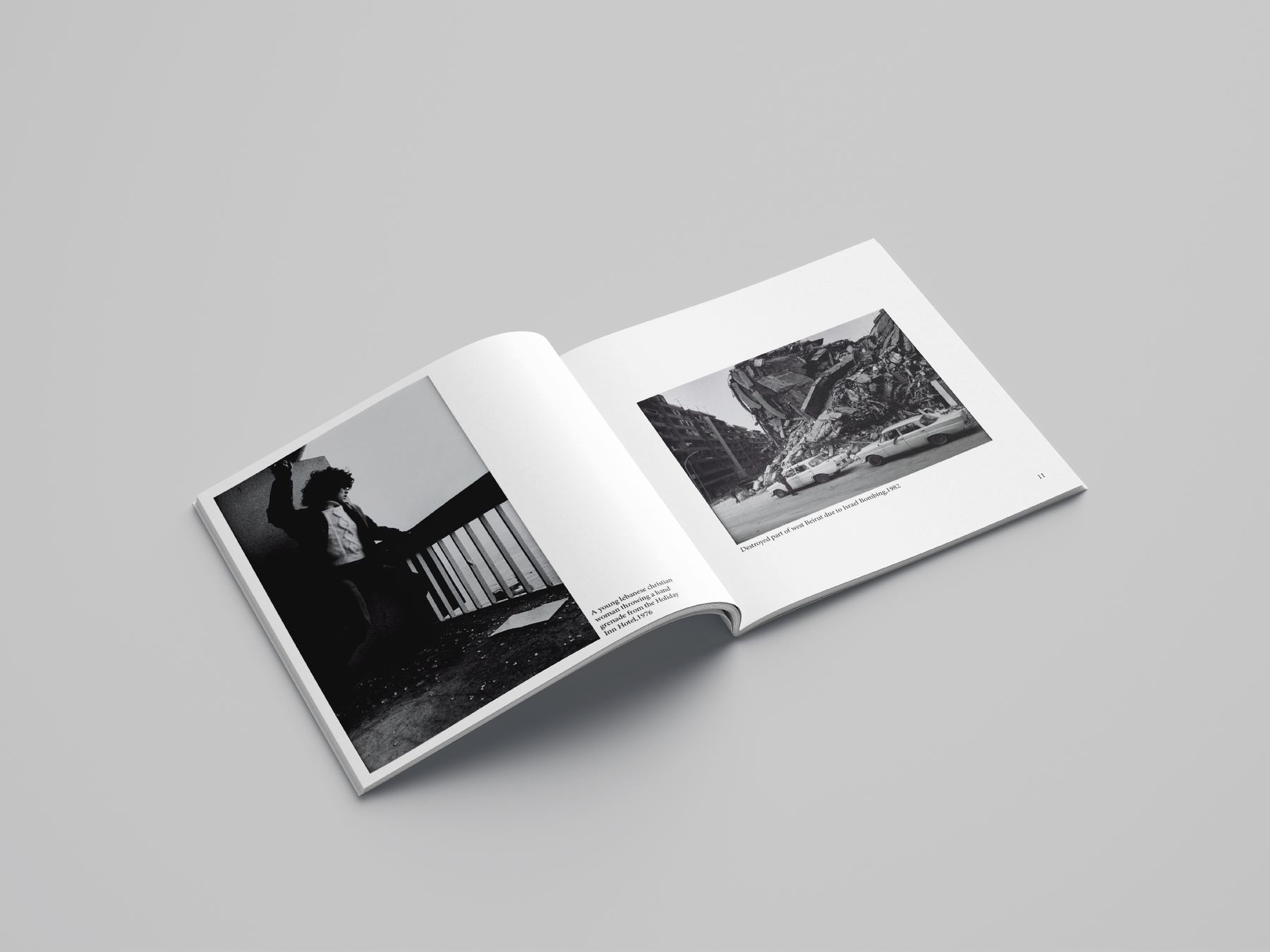
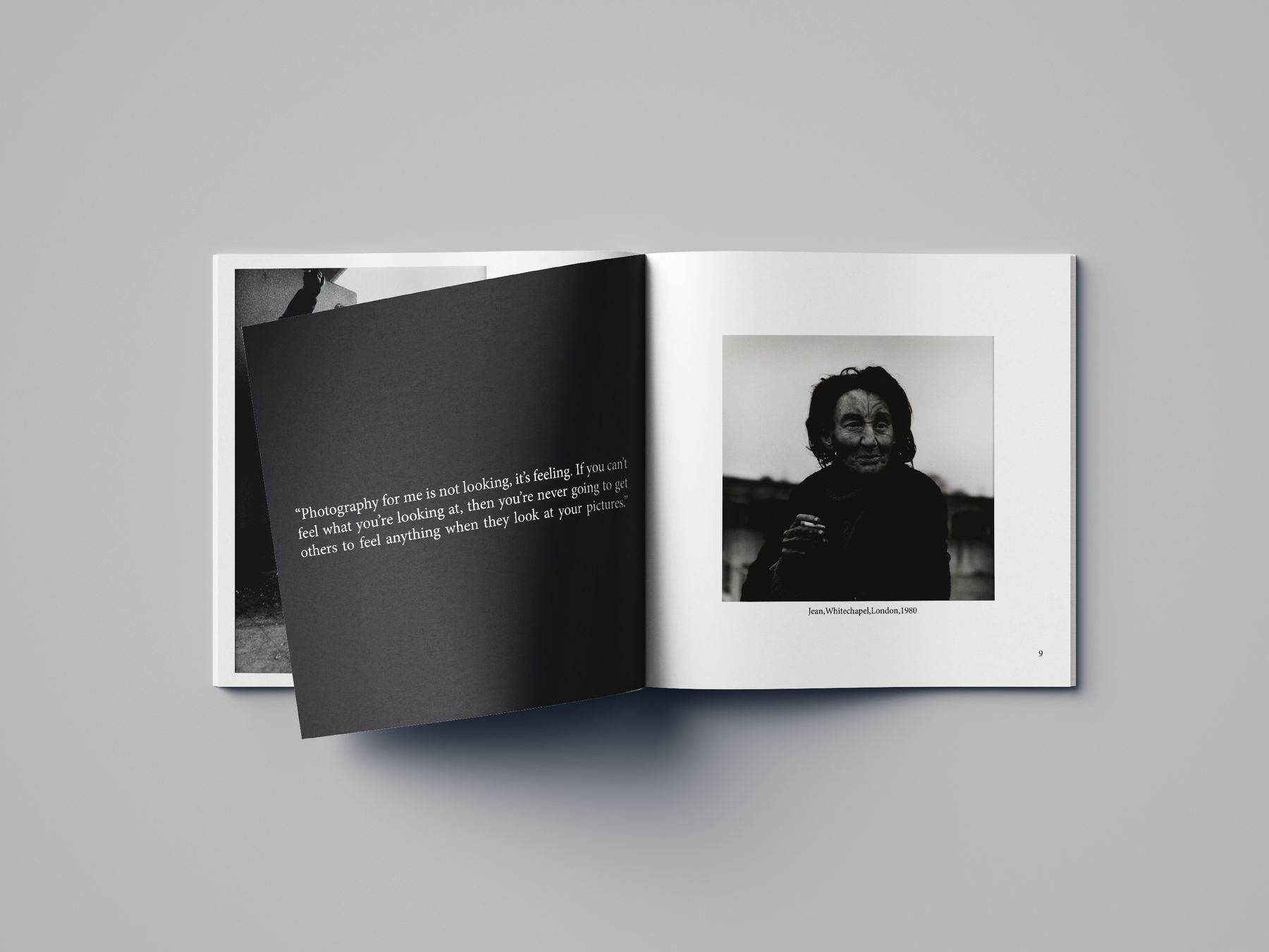
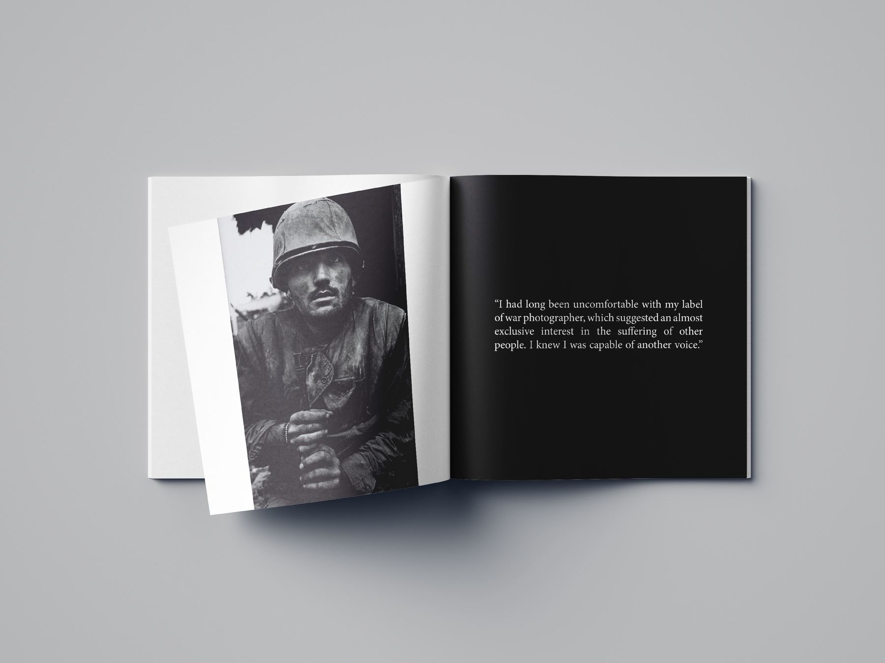
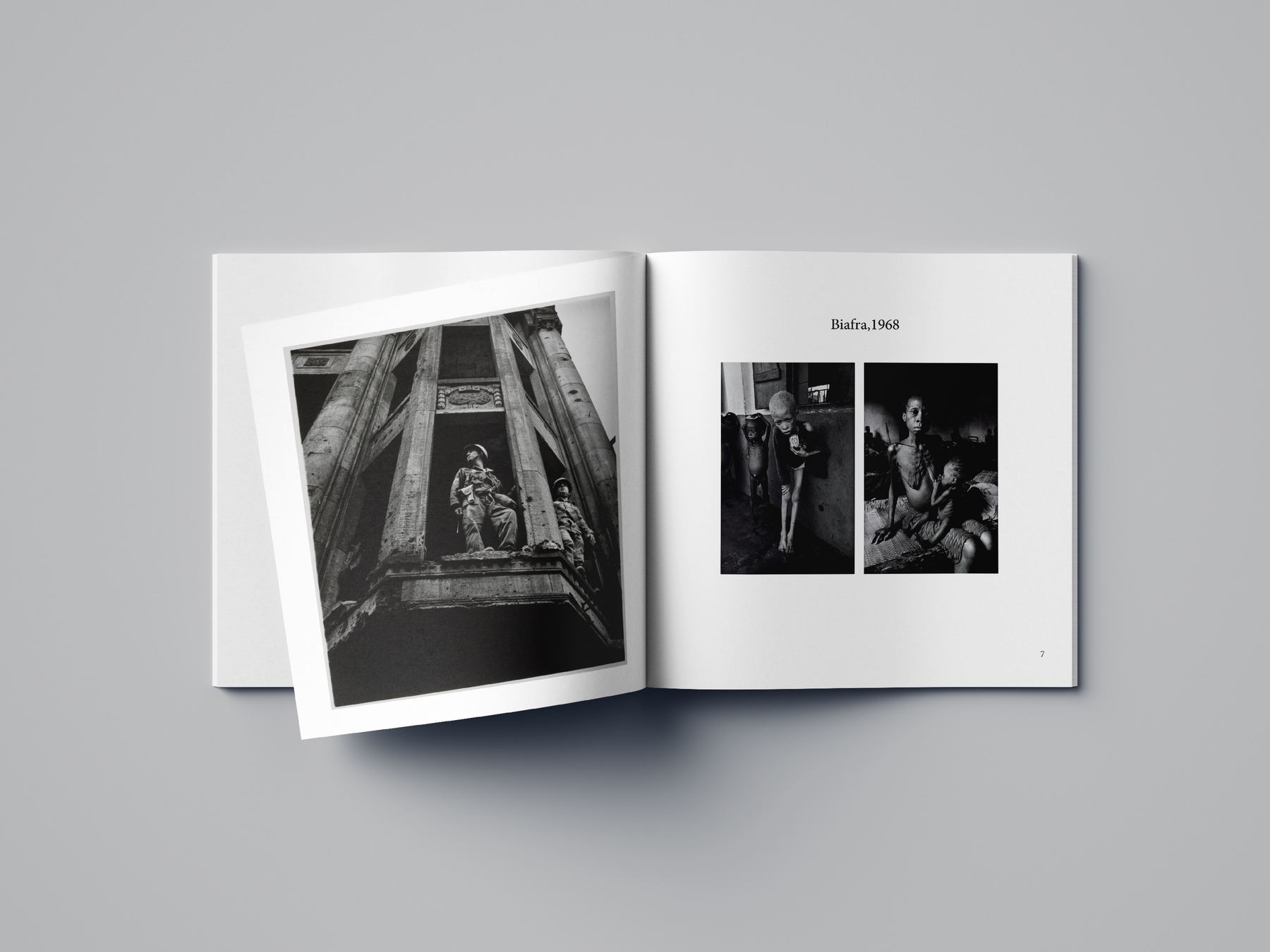
A landscape monograph of black-and-white documentary photographs. One grid runs the whole book: plates sit full-bleed, half-bleed or small on white, and the page turn decides which. Chapter openers invert to black so a single frame can carry a spread on its own, and captions stay in one narrow measure at the foot — the same measure, every page, so the reader stops noticing it.
Scroll the strip →
persian editorial
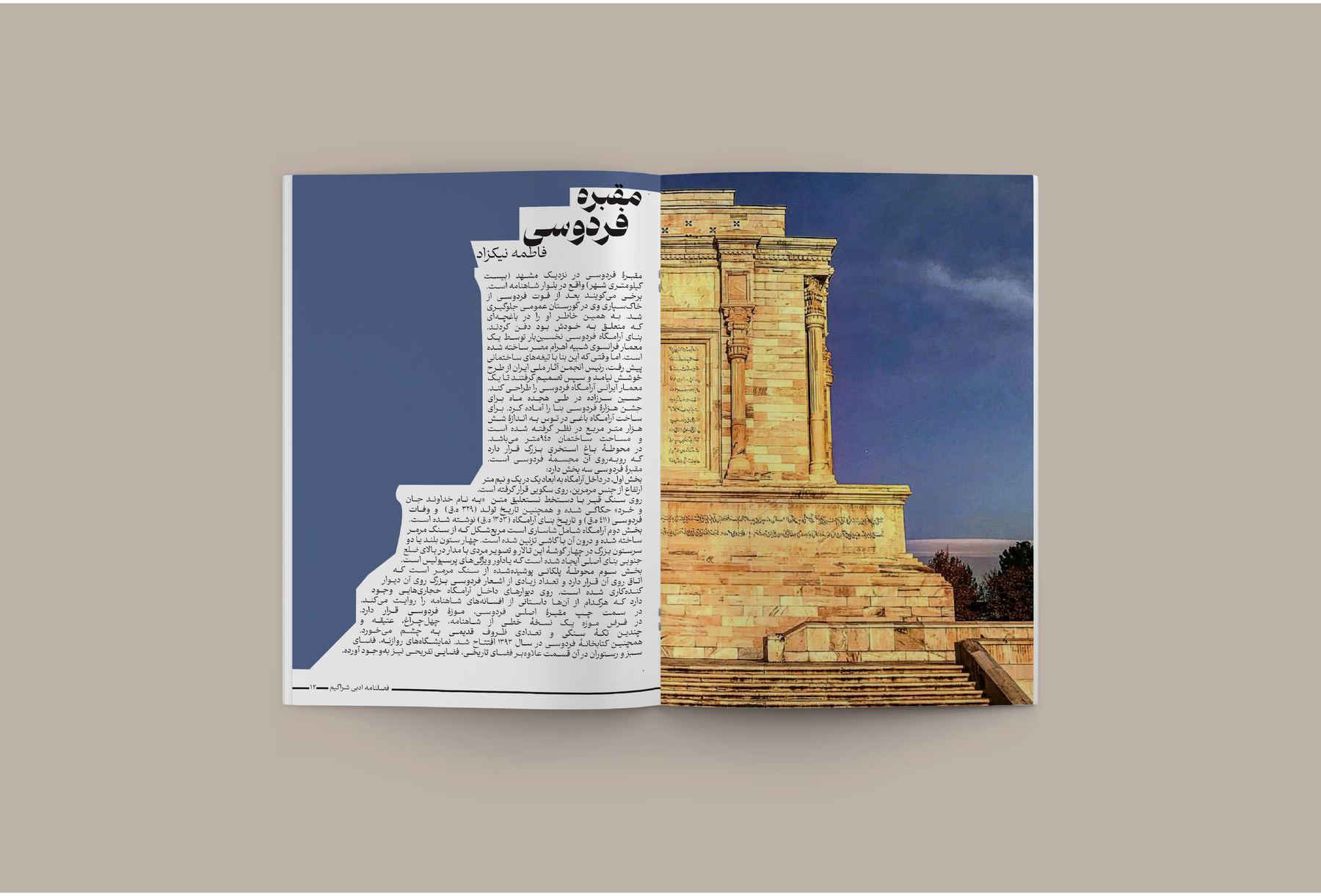
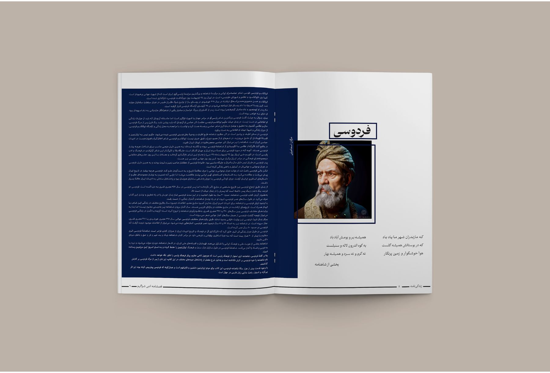
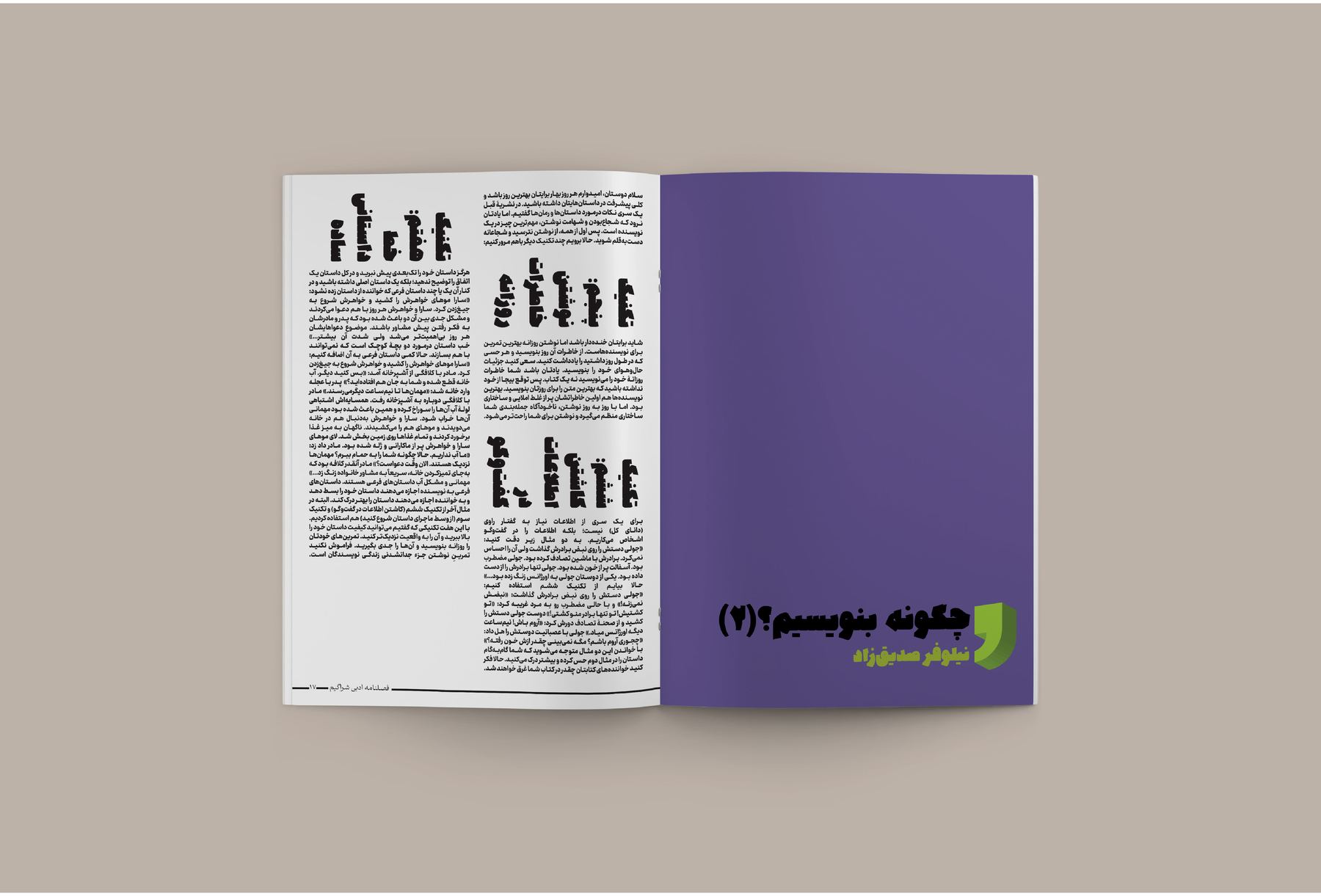
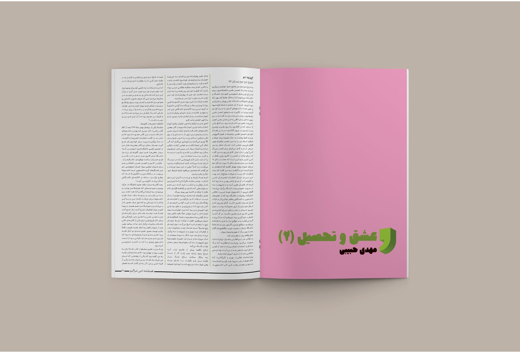
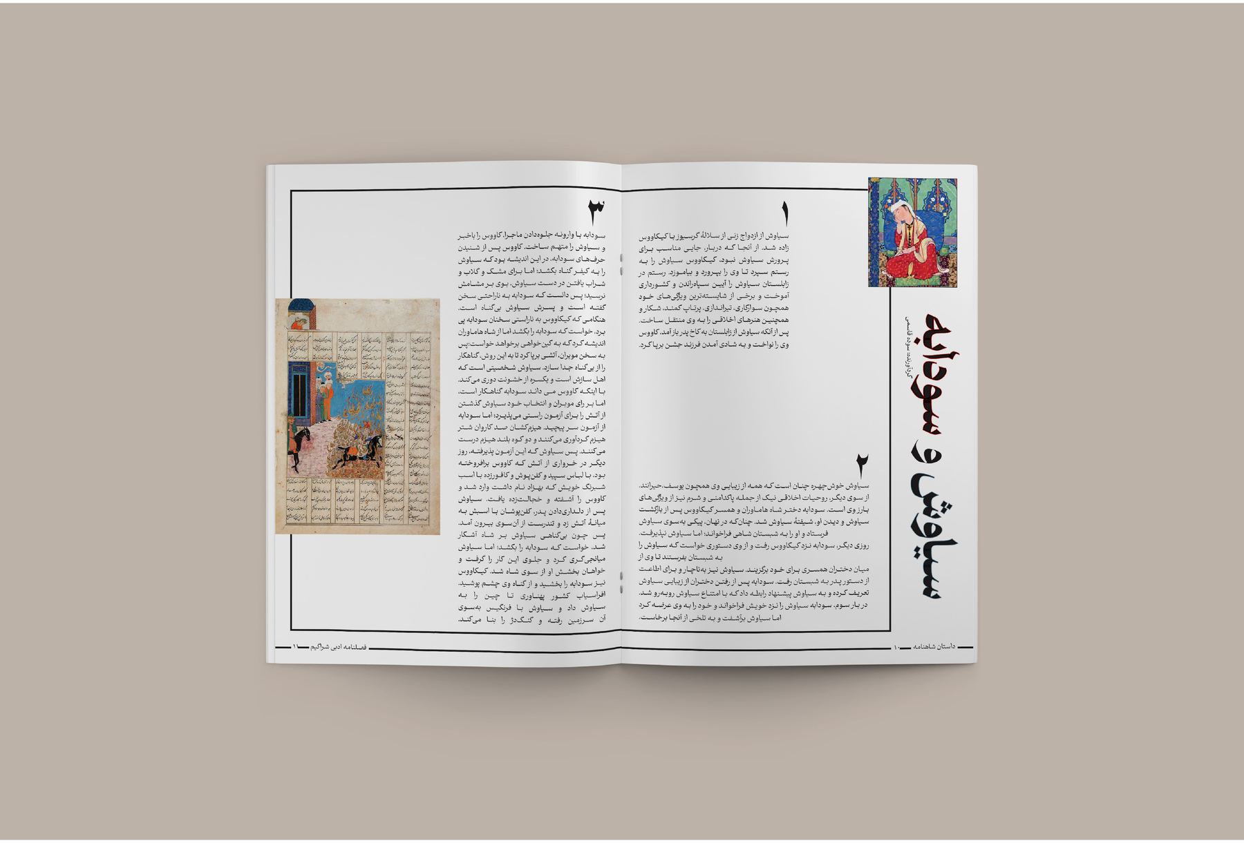
Long-form Persian, set to be read rather than looked at. Justified right-to-left columns hold an even colour down the page; a feature on Ferdowsi builds its opening out of the mausoleum's own stone; an essay is illustrated with nothing but chess figures in the margin; covers land in flat institutional colour — pink, purple, green — with the title as the only event on the page.
arya yaragh sanat
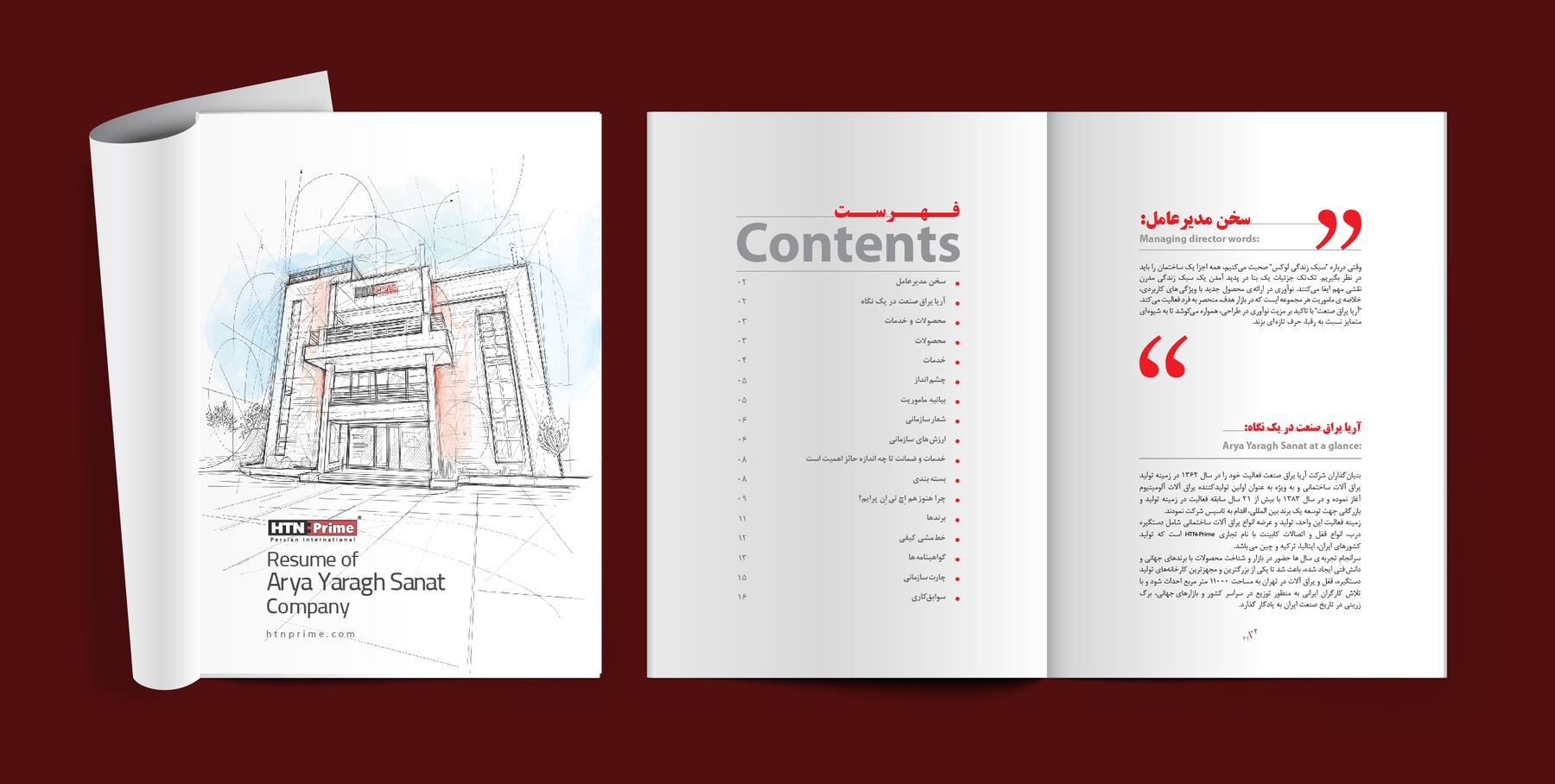
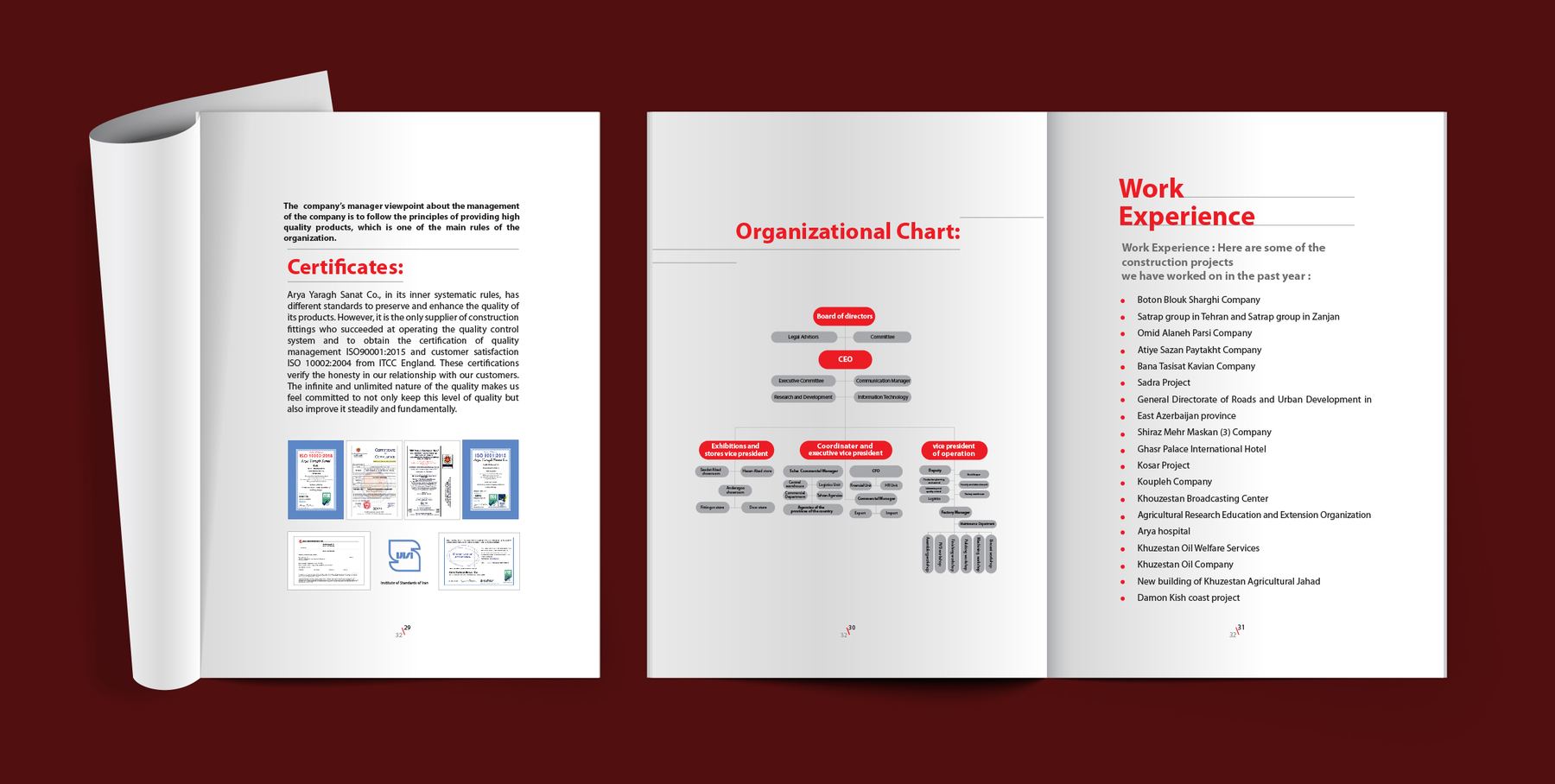
The document an industrial supplier hands over before a tender — so it has to look like a company that finishes what it starts. The cover carries a line drawing of the building rather than a photograph of it. Inside, a contents page, a red pull quote from the managing director, scanned certificates, an organisational chart and a work-experience list: all the material a procurement officer actually checks, arranged so it can be checked quickly.
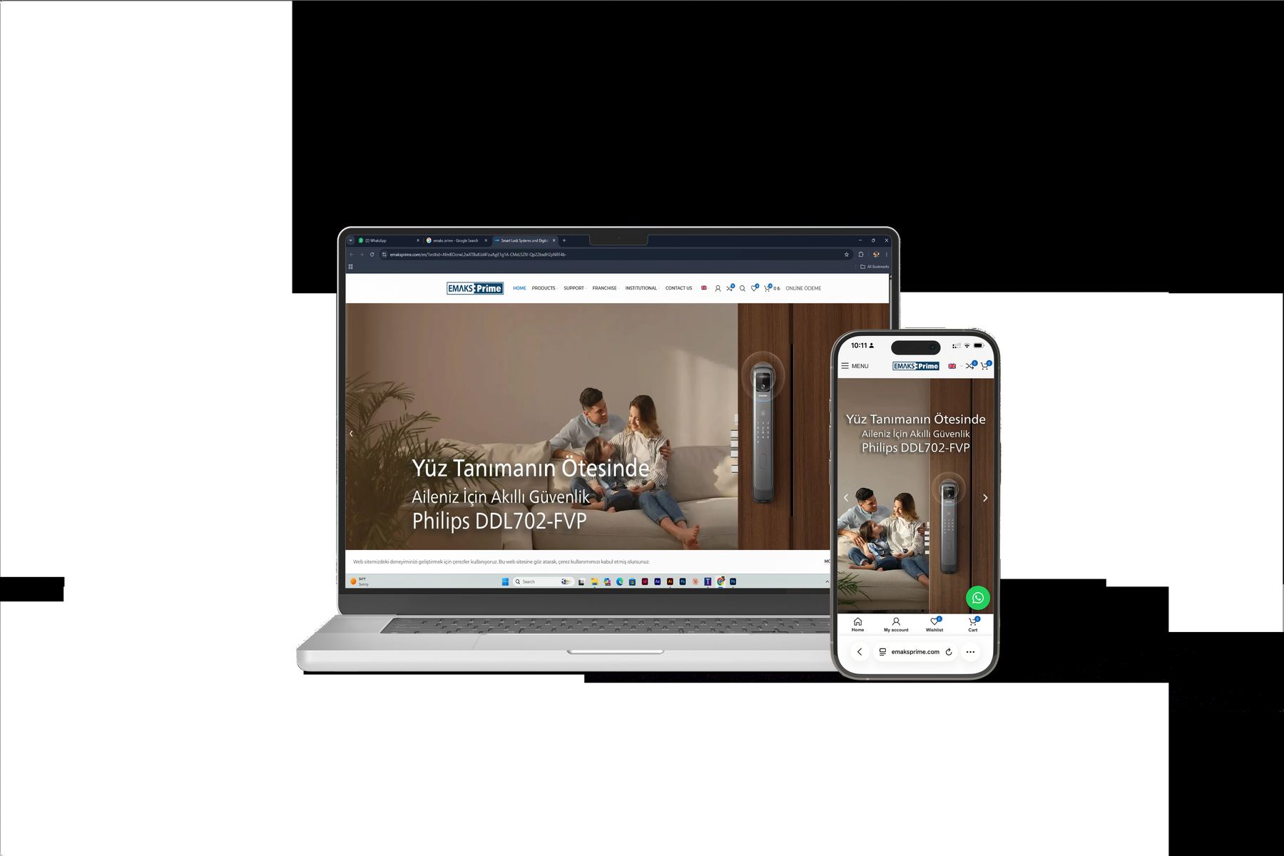
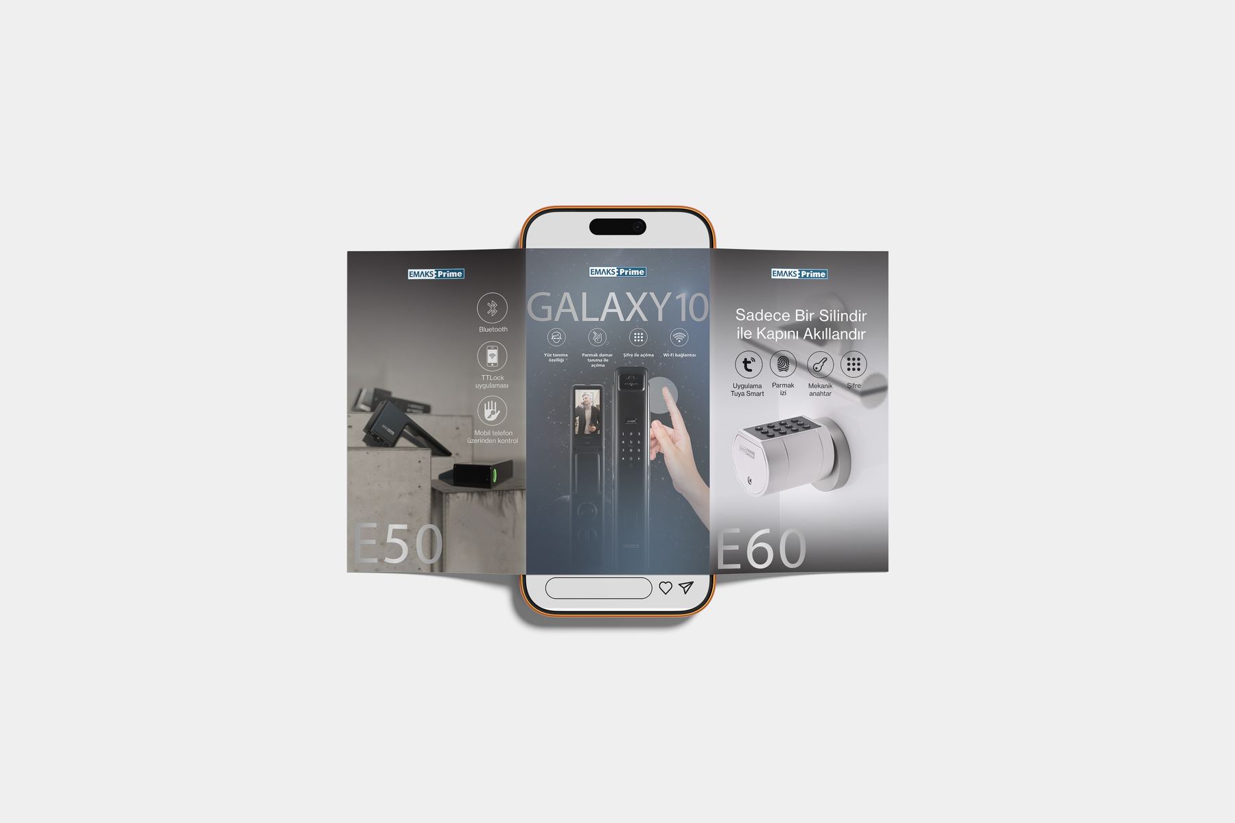
htn prime — digital
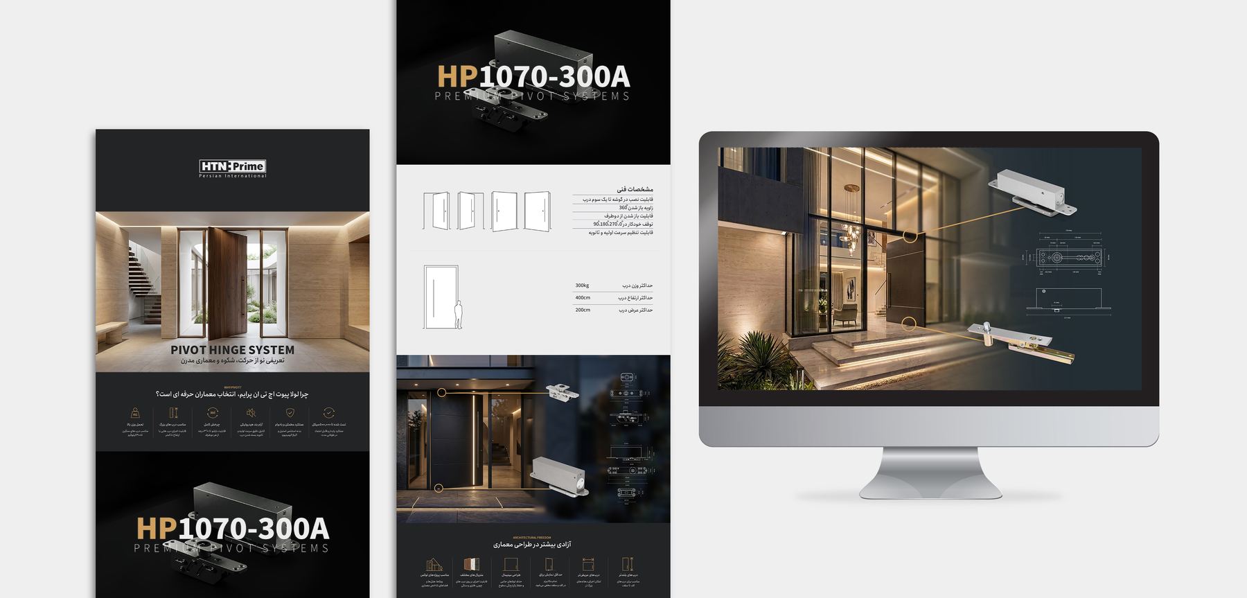
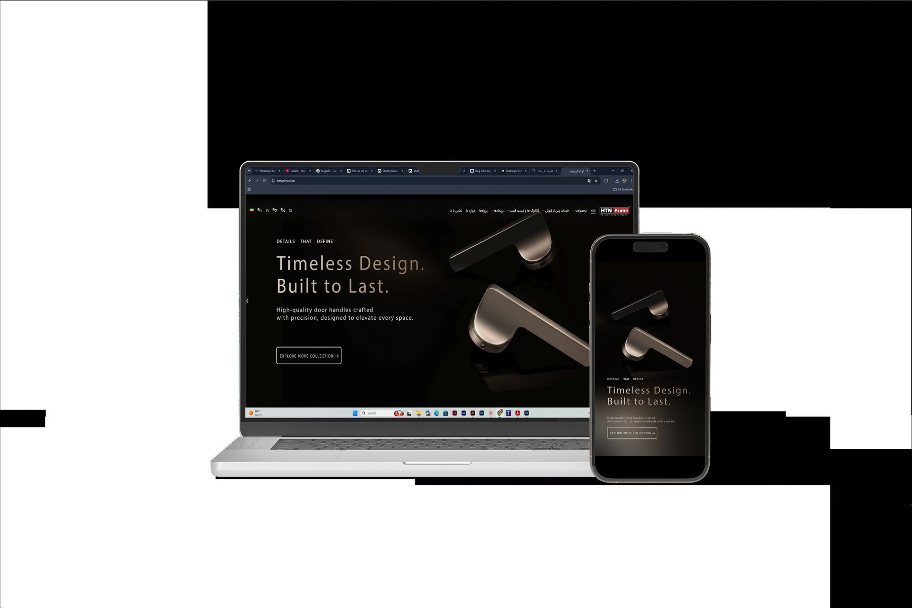
Ongoing digital content for an architectural hardware brand: landing pages built around one product at a time, dark site sections where a brushed handle can be lit like an object, spec blocks that stay readable next to a rendering, and story-format social that puts two models side by side and lets the difference be the message.
the product catalog
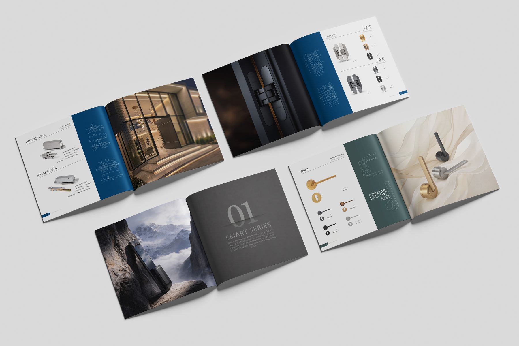
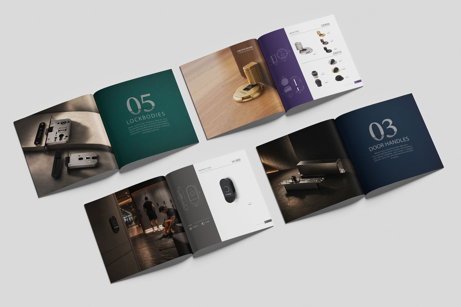
A square hardware catalog that has to do two jobs at once: sell an interior and list a part number. Each chapter opens on a numbered colour plate, runs through full-bleed installation photography, then hands over to white pages where the products line up as silhouettes with their dimensions. The colour is what tells you where you are in the book.
tools
Every day
- Adobe IllustratorLogotypes, marks, vector artwork
- Adobe InDesignBooks, catalogs, long-form setting
- Adobe PhotoshopRetouching, repro, composites
- Adobe AcrobatPrepress, proofing, handover
Also working in
- HiggsfieldGenerative image and video
- PowerPointClient decks and presentations
- WordDocuments and templates
Learning
- FigmaInterface and web layout
- After EffectsMotion for social content
experience
Practice
HTN Prime
Social content; print — catalogs, brochures, company profiles; site content including landing pages; exhibition graphics. Since October 2024.
Freelance
Identity, editorial and print in Persian and English. Clients included Mazandaran University and Kumu Furniture.
San'at Yar — internship
March to August 2022. First studio placement, working alongside the design team on production.
ATP Gallery — Munich
Gallery design work.
Education
Sooreh University
BA, Graphics. Four years in Tehran, graduating in 2024.
Two years in practice
Working across exhibition identity, brand and logotype, books and Persian editorial, catalogs and company profiles, trade stands, and the digital content around them.